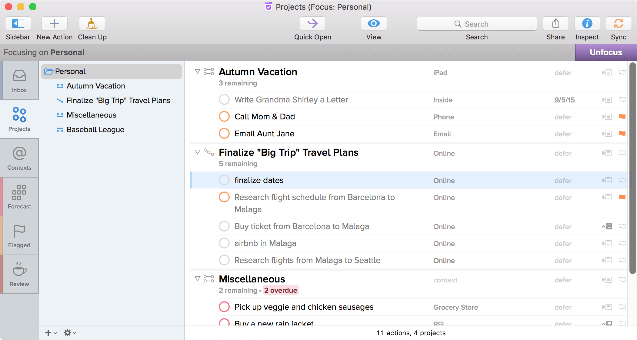
I’m running into issues in that I can’t see the circles to click on to complete tasks in either compact or the older view. They are too light!
I´m having a little problem after the new update. I´m using the compact layout from the link below and when I click on a task to flag it nothing happens. Is this happening to anyone else ?
if you have the task selected, you can tap the space bar to mark the task as complete.
The compact mode is still an experimental feature that hasn’t been fully implemented. The radius for mouse clicking might be very small and harder to click.
Yosemite was always too light for my comfort. I went to system preferences > accessibility to set the contrast to normal and reduce transparency. That might help you.
I’ve done that. It helps but still way too light.
I’ve been extremely lucky to find this post. The density of information available beforehand I felt was always lacking and now I can successfully fit 2-3x the number of items on a list. This makes scanning much easier especially with larger more complicated projects.

Being a keyboard-focused user I don’t have an issue with the circles or flags. I think visually they should rearranged to be side-by-side. If the flag indicator was moved to the strip on the far left of the item (like it is in the perspective sidebar) that would be best. Alternatively you could stack it so that flag and circle are right next to each other (and in that order, circle flag doesn’t make sense to me).
So…this is a weird edge case, but I believe that something in the compact view crashes Dragon Dictate whenever it’s unmuted. I know this isn’t really a you problem, but it seemed worth mentioning.
Is there plans to have the context column back as well and be able to simply click on the column headers to sort a-z and z-a again? That would be so helpful! Add that and styles back and I could finally make the complete jump to OF2.
@kcase Are there plans to continue working on the compact layout? I use it but there continue to be many bugs and usability issues. Wondering whether to return to OF1 or wait for improvements here?
Thanks Ken for confirming the bug where the tab key skips past the defer date. A year has passed since then and I’m hitting this bug every day. Is there any prospect of a fix for this?
1 Like
Yes the tab problem is very irritating and the fact it’s gone unfixed for so long is disappointing and doesn’t live up to the sort of quality I’ve come to expect from Omni.
Another reason why I’ve gone back to OF1, and am glad I did.
@derekr: Nice! I’m looking forward to the public test as this new layout looks like it will fit my needs perfectly!
This will be the most significant enhancement to OmniFocus 2 for Mac. Where’s it been all this time?
I guess you still won’t be able to see the inbox in a project, right? Sigh. That’s still my deal breaker.
Hooray! I have been using the url setting this entire time and enjoying it. It looks like the flag icon has been moved to be easier to click. Are there any other changes from the existing url-setting for compact view?
Public test builds of OmniFocus 2.3 are now available!
