Though the topic was addressed previously, only a work around was discussed and I thought that it bares opening again since there was no mention of a change in an update. The change is very simple as even though Omnifocus uses the calendar color as a choice, it should simply follow Apple Calendar (in dark mode) and give the same text colors for the calendar in question
:
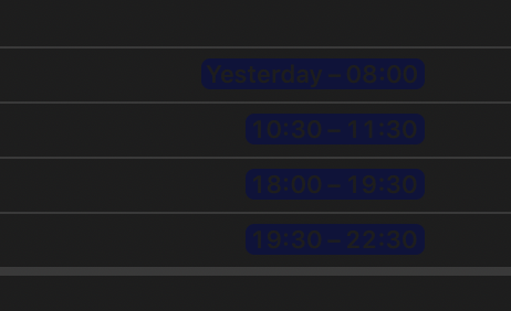
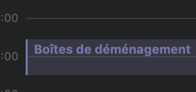
For example, this is my blue calendar in Apple Calendar, but here is what text from that color calendar looks like in Omnifocus 3 Pro Forecast view:
So, I just wondered if there’s an update on this issue versus just settling to change my calendar color in Apple Calendar because as the person mentioned in the article their still seemed to be an issue with gray on black for passed event times.
Yeah, it’s still hard to read lists in the dark mode. They need to fix this is an update. another example is the “Change view option” (eye icon) menu. Because of the transparency of the window, the list of options in gray are hard to see.
 :
: