Hi, im wondering why there does not seem to be a way to customize the (new) color-area introduced in v7? Or am i missing something?
I love the big buttons, but they are completely useless if im not able to change colors…?
Hi, im wondering why there does not seem to be a way to customize the (new) color-area introduced in v7? Or am i missing something?
I love the big buttons, but they are completely useless if im not able to change colors…?
Not yet! We think it would be great for that area to be customizable, and our design team sketched out how that would work some time ago, but we haven’t had time to make that change yet. (In the past month we’ve been focused on bug fixes, localizing the app into 10 languages for our international customers, improving SVG support, adopting sRGB as our default color space, and making sure we have great support for Apple’s new Touch Bar.)
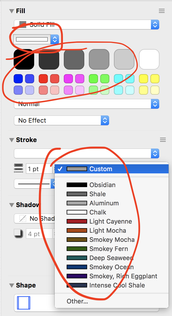
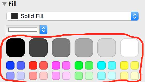
Just want to remind you to keep this on the fix list. These would be GREAT if they could be customised (and the default dropdown colours). Right now they are taking up room and annoying and a bit of a step back as the workflow for altering colours on an object has become more clunky.
The v7 colour interface (both the popup menu and the awkwardly large palette of colours) really needs cusomizability.
Devoting so much screen space (and priceless development time) to a selection of colours that could only please Mondrian or a four year old child seems wasteful.
Until the team can deliver customisation (this is not a criticism, I know they’re busy!), I would sincerely prefer to hide this clutter and go back to the single colour well from v5.
Agreed, can we have a roll back to the original interface until this is fixed, really annoying unless you are a 3 year old child that paints only in primary colours.
I don’t think returning to OmniGraffle 6’s blank space is really an improvement:
But we all agree about wanting to customize that default palette, and we’ll get to it as soon as we can. (But there are other features that are currently higher on our list, like improving the options for canvas autosizing and restoring support for browsing stencils within the main document window.)
Quite correct.
It is ridiculous to waste development resources, customising such a thing. And the thing is an ugly thing.
No, no, no !!! You are missing the point. When I said:
What I meant was (and I have stated this in several related threads), it is a waste of time to develop something that:
The single colour well in the OG 5 Inspector opens the Apple ColourPicker.
Yes. Period. Forever.
And spend your development time and money where it does not replicate (poorly!) functions and features that already exist in the platform. God knows you are busy. Make the busy meaningful, cost-effective, non-wasteful.
Definitely not. We don’t “all” agree.
If you “listen” to what the newbies “like”, sure, you will have an inspector that wastes a mass of real estate, taking up valuable space, providing a poor colour picker that has a small fraction of what Apple already provides.
If you had developers who knew the platform that they develop on, they wouldn’t have developed a colour picker that provides a fraction of what Apple already provides. Then the newbies would not have a _thing_to request improvements for. There would be no thing to improve slightly while still taking up masses of real estate in an inspector.
The act of “replacing” the single colour well in OG 5, is in fact a removal of the feature to access the Apple Colour Picker directly, in a single keystroke (if it isn’t already open). You do not seem to appreciate this point.
If you “listen” to mature (in both the Apple and the OG sense) heavy-duty customers, you would remove the butt-ugly (refer to the comments of others) thing that takes a mass of space in an inspector, and requires more keystrokes to use, and return to the OG 5 single colour well that calls up any colour scheme you want, customised to suit all your apps, in one place.
True. But only half true, and devoid of context. Agreed, that the OG 6 Inspector is plain stupid.
Your scope of comparisons appears to include un-useable products (OG 6), and thus the comparison produces an favourable (only to you) result, leaning towards a wasteful redundant thing that has a fewer features than the Apple thing: it preserves the insanity.
Now if you extend that scope to include useable products (OG 5), it eliminates all the insanity, and returns the product to one with fewer key strokes, using the full-featured Apple Colour Picker. It removes the thing that should never have been “developed” in the first place. But no doubt, someone in OG development or product management will be very attached to their useless wasteful thing, they will “like” it, they will point out that newbies “like” it as well, they will not give it up on the basis of realistic or commercial factors such as cost; logic; avoiding reversals; product utility; product efficiency; etc.
You have provided a comparison which is invalid, as described above. Here’s a comparison that includes the honest scope:
Still only half true. Give us OG 5 which has much more efficient controls in the Inspector (tool, high-value real estate). That would be merely returning to us an efficient feature that you have removed, it would not be an “improvement”.
The full truth is that that “blank space” turns into controls that are demanded when something other than SolidFill is chosen. So it is not what you present it to be. The way you have stated it is not logical, it favours the margin (retention is a wasteful feature, with a tiny fraction of what is already available in the standard), and kills a Straw Man that you have erected, without addressing the substance of the issue.
Respectfully disagree that we should ONLY rely on the Mac default color picker. For instance, the Adobe suite has integrated palettes and they make life very easy. So, either remove this monstrosity with the crap default colors that is taking up FAR too much screen real estate, or do it right and integrate a customizable palette. But expanding the amount of space taken up by the terrible color picker was the wrong solution.
There may be a bit of misunderstanding there.
The goal of my advice to return to the OG 5 Inspector set up (for colour) is to remove the massive waste of space.
The goal of using the Apple Colour Picker is to conform to Standard, which, if understood, will reduce work for everyone: the developers; the new users; the power users (who set up their colours in one place that can be used across all apps).
The Apple ColourPicker is not “one” set-of-colours, or “one” method-to-choose colours. It is a common, standard GUI for accessing any set-of-colours, using any method, that you choose.
In the graphic above labelled Apple ColourPicker, there are six Methods of choosing colours
In the graphic, which is an example only, I have chosen ColourPalettes. Within that you can set up (via the gear button) as many different ColourPalettes as your heart desires. Likewise, if you chose a Method that allows customisation, you can set up the colours you like under that Method.
As an example, I have six ColourPalettes under the ColourPalettes Method, eg. WebSafe colours; etc. That is the customisation people are seeking. The graphic shows a single pallete SG Standard, which is the name I have given to my chosen set of colours. I maintain in one place, across all apps.
It allows variations for different printers (the high-end print shop you use has a printer that prints different shades than your cheap printer at home); etc. It has future use in mind.
You cannot get anything even approaching that in an app, as good as Adobe, or a bad as OG. Just look at the mess they have made of it in OG 7, with colour wells for a five year old, taking up masses of real estate in an Inspector … when standard ColourPicker has its own Inspector.
Cheers
Picking color is a big part of the process. Apple color picker’s swatch library on the bottom is now broken after the MacOS 10.13 upgrade and I don’t think they are going to fix it.
So the ability to edit the defaults should be moved up the priority list. All color dropdown should be addressed: fonts, stroke, and fills. For me the Color Palettes tab on apple’s color picker is just to heavy handed and on top of that I don’t really like having Apple’s picker sitting on top of my work all day.
Completely agree with @uxblueprint and @GraffleGuru. The need/request is quite simple - please let us replace the canned colors in in the color picker dropdowns (for fill, stroke, font face, etc.) with our own set of colors. As someone who designs software for a living and runs a software company, it’s difficult to understand why this is a challenging thing to support. While I’m not a fan of the new color swatches within the Fill inspector, I’d be fine if they stayed but you let us customize the colors in the color dropdowns since it takes many more clicks to get to colors previously added via the “Other…” option in the menu. Please reconsider the prioritization of this request.
This started in Nov 2016, last entry in 2018. Is still no remedy around?
Rollback to OG5 as quick-fix preferred here too.
Test builds of OmniGraffle 7.11 are now available, which add support for customizing these solid fill palette colors:
https://omnistaging.omnigroup.com/omnigraffle
Drag a color from any color picker or color well onto one of the color tiles to change its color. (You can undo any changes by right-clicking on the tile and choosing “Undo” from its contextual menu.)