I just asked about the implications of running iOS / iPad OS betas in the Slack channel. I’m keen to carry on the beta’ing process as this has been one of active discussion with OmniGroup - as betas should be.
I use the iOS versions of Omnifocus mainly as a companion to the MacOS version. I see many advantages in the new OF 4 on iOS, but I do agree with @Janov that the interface is getting cluttered, especially on the iPhone. It is very difficult to create a great UI/ UX that has all the features of a full blown desktop application available in an iOS app (especially iPhone).
Personally I would be happy with a simplified view of my tasks when I’m on the go. This might be something that can be achieved (in the future) by having a choice on which options to have available in the outline by default.
2 Likes
To me this is reminiscent of the first v2 of OmniFocus they pushed out then scrapped completely, albeit only the Mac version. The design was so bad they couldn’t continue with it and to some extent I see that happening here as well particularly on the iPhone version.
I started beta testing yesterday and frankly probably won’t be for long. Whilst it works better on the iPad, it is unusable on the iPhone in its current form. From a UI/UX perspective it is a major step backwards. I appreciate that it is in beta but it just doesn’t feel me with confidence that the end product will be much different.
4 Likes
What is it you dislike about it?
To list some…
The UI is just a blast of icons, too many, many far too small, indiscernible, not intuitive. An action on the iPhone has a very long list of icons to set the various elements, so many that they drop off the right hand side of the screen and have to wrap around to a second row. Little meaning as to what they are, you have to guess. And a very obvious omission of one to set the project, please tell me I don’t have to set it via the (I) button off on a separate part of the UI?
The new Forecast is now just taking up valuable real estate without providing justification for it. This has now taken a big step back from v3.
Any view which lists actions and projects has little visual distinction between the 2.
The project related status icons are now so small you can’t read them.
I had hoped that v4 was going to remove some of the complex UI manoeuvrability and simplify action and project management, but it appears you still need to work your way through 4 columns of UI to do this, probably at least the same as v3.
Some elements which I am hoping are just beta snags, like the spinning update wheel nearly on every view change, and the awful large grey block which describes the current view filtering.
To me the iPhone version is pretty much just a shrunk down version of the iPad one and which doesn’t work on that form factor from UI/UX perspective.
To me this doesn’t indicate a move forward for these 2 versions, rather the opposite. I can see a lot of work has gone into them, and hats off to the developers, but I hope this evolves much further than what it currently is.
4 Likes
I’ve also dropped out of the Beta program and deleted OF4. If the final product is anywhere near how it looks now, I’ll be a 2Do / Things owner (again!). On the Mac, that ability to see my calendar and tasks is summarized in the best display, to me anyway, in the industry. I’ve always only used OF on my phone as a quick check; no serious work occurs there.
That said, at least in OF3 I could quickly see the Forecast statistics and it wasn’t so jumbled in it’s graphical representation. OF3 was really laid out well in that Perspective.
It was a good test and everyone has their own workflow. It won’t stress me out to lose OF on my phone. But man, I am holding my breath that the same team doesn’t touch the Mac version!
3 Likes
I just had a very scary thought…
What if the mac version 4 is going for feature parity with the iPad version 4, and not the other way around?
That would mean I’d have to keep a big sur workstation running for a long time in parallels, and start webdav syncing!
That’s really, really scary!
Thanks, @Deejacker, for specifying things you dislike with the current state of the OF 4 for IOS beta. That makes it so much easier to understand why our views differ.
To me, all icons in the row for an action make sense. Considering how small they are, I find them impressively clear and logic, and if a couple of them might not made sense immediately, I quickly learnt their meaning. As you can have the icons in the order you like, you may have the most used ones shown, not bothering about the second row (that is now hidden, after some beta version showing all rows). In the beta version I use, there is an icon for setting the project.
I much preferred the earlier beta versions, though, where you tapped directly on the icons showing parameters that already had been set. But there is apparently a conflict between compactness and tapping areas, as some users found it difficult to tap correctly. That also affected the filtering indicator. It was originally only a line of text, and for a while an even bigger grey block. I have come to like it the way it looks now, as it so clearly signals that the view is filtered, and so easily lets me unfilter it.
My guess about the Forecast view is that it’s not finished.
1 Like
It is good to hear another perspective, so thanks for sharing.
It is a beta and evolving so hopefully we will see some more end result structure finalising shortly.
Forecast is still a concern, I hope we don’t loose the features v3 brought.
2 Likes
Jan_H I hope the Forecast view does get finalized and that it offers at least a good nod to the old counts and dues as OF3.
But I do recognize this isn’t finished and am being super hopeful.
1 Like
I don’t get it. I’ve been trying the Omnifocus 4 beta, and I like the UI, but my question to Omni is this: Where are the new features? I remember when Omnifocus 3 was in beta, and the message was ‘look at the new interface. We’ll be adding more features later’. Is it later yet? What happened to features like task sharing with other users, which Omni has been promising and ‘working on’ for years.
I just don’t get it. How can a product that’s as mature and expensive as Omnifocus, still not have basic features that the built-in app that comes with the device has? Shouldn’t Omnifocus be at least as good as Reminders?
3 Likes
“New features” depends on who you’re asking. If you’re exclusively on the iPhone or iPad, new features includes some features that were only present on the Mac and have finally arrived on the iOS platform. Quick Open and the sidebar showing the list of projects or tags in a perspective are now present. The ability to focus on projects are folders have also arrived. If you’re on a Mac, you’ll think these were old features. But for many of us who work primarily from their phones or tablets, it’s a feature set we’ve been waiting for a long time.
Reading the Omni blog, it’s been stated that OmniFocus 4 was rewritten from the ground up in the new SwiftUI programming environment. This means that a lot of legacy code has been removed and replaced by new code that will provide a new foundation for future updates. The code that is being built for the iPhone/iPad will now be easily transported over to the Mac when OF4 for Mac development starts up.
iOS development and Mac development was developed separately from each other. The SwiftUI environment helps to speed up future app development.
In the v4.0 TestFlight, users are testing the stability of the new code. Use this Discourse forum or the OmniFocus 4 Slack channel to discuss with other users about their discoveries. Go to the Settings screen and tap on Contact Omni to send an email voicing your concerns or wishlist directly to the Support Humans.
As a person who uses the iPad and iPhone about 90% of the time, OF4 allows me to use OmniFocus when I’m not near my Mac (which is most of the time for me).
There will come a time when we may have to upgrade our database to handle new features. I remembered an update a couple years ago where we had to migrate our database to a new format that will handle floating time zones. For now, the idea is to be able to use OF4 on iOS and OF3 for Mac. To maintain compatibility, feature requests were tabled for the moment. When OF4 for Mac is finally released, we’ll probably see new features that will make the wait worthwhile.
Personally, I’m glad to step away from my Mac more often. OF4 is still being tested. The Support Humans are trying out new UI changes and letting us try them so that we can give feedback about what we like or don’t like.
Nothing’s finalized yet so it’s an interesting time to get familiar with OF4 while it’s being developed.
2 Likes
As someone who was in the Beta early and quite vocal about certain issues (mainly on the phone) I dropped out when IOS15 became a requirement. I decided to look at options and spent a considerable time entering a lot of information into other systems. This is my take…
Things3, never understood its appeal or the cries of how wonderful it looks, its opinionated, does not scale and very quickly falls apart with numerous projects and SAL’s
ToDoist I wanted to like this, and it has a lot of good points, sections allowed me to remove a lot of tags I needed to filter, checklists are useful but they do not inherit the parent tasks repeat settings. Natural language input was really fast and the ability to have tasks appear in the correct place and time via email from zapier form software etc was really good.
Problem, its an electron app, no real keyboard shortcuts and while I can get round the lack of defer dates I found the pressure of having dates set as “due” rather than defer (start) was off putting. Also the information density meant a lot of white space which was a waste.
2Do. Honestly if this was kept up to date and I could trust the lone developer to provide updates I may well go for it. Supposedly a new version is coming by end of year (in Swift) but despite it having everything OF has plus some, its a big risk putting my business into it.
I have now gone back to the Beta, I am getting used to it, I largely ignore the inline inspector and just go the the traditional panel one especially on the phone, but it’s definitely getting better and I do trust OmniGroup to get it “right” eventually.
No task manager is perfect but for me at least OmniFocus ticks enough boxes to keep me with it probably for the foreseeable future.
6 Likes
I thought I would chime in with some thoughts after having used the beta for a few weeks. To summarize: I do not think the UX changes work well and for the first time in years it has me considering whether OmniFocus will continue to be my productivity workhorse.
First, some context. I have been using OF as my daily productivity system since the earliest Kinkless GTD days. So I’ve seen the evolution and I know my way around the app very well, on all platforms.
The new direction on iOS is causing a lot of friction for me on several fronts.
-
I understand that we’re in a beta but the stability has been awful. Tap a task: crash. Switch to a perspective: crash. Bring up the inspector: crash. Syncing: slow, problematic, sometimes not at all. I get it: betas are rough but I wish they would be usable for the most part.
-
The new inline editing paradigm simply does not work well. I tap a task and up pops a row of icons, or two, with a very small size (at least on an iPhone 12 Mini). Tapping out of inline editing is not intuitive at all. Where are you supposed to tap? On the task itself? Nope, edits the title. On the tag above (in a grouped Perspective)? Nope, that collapses all tasks under that Tag. The only reliable way to exit inline editing is tapping the tiny whitespace underneath a checkbox. Using the rest of the inline editor is a bit hit and miss. You can inadvertently add a due date, for example. And visually, it’s a hodgepodge of icons, lines of text, tag buttons, etc. Playing with the viewing options did not really improve things. In my personal experience, inline editing really fails on the UX front, I am very sorry to say.
-
Over to a standard perspective view. It’s a perplexing forest of icons. 7 icons in the top row, 6 at the bottom. And it’s just plain confusing. There’s a search bar at the top, which would indicate local search of your perspective, but also provides a search everywhere. After opening the search, it cannot collapse anymore (maybe a bug). Then there’s the typical ellipsis icon with a few random commands, then the inspector. This list sort of makes sense. The trouble starts with the bottom bar. There’s are literally two list icons next to each other. So the first brings up a switcher for perspectives, OK, fair enough. Then it’s over to tags, which could have already been filtered another way because there’s a Filter button in my Perspective? Undo is a logical one. Then there’s a keyboard switcher? So this appears to be Quick Open. But that’s just a mix of things like the perspective list and search. Next, a plus button. I assume this works in some contexts or views? Since it doesn’t work in my current perspective. And finally, add to inbox. Extraordinary. It seems like every possible way to display an aspect of a perspective, task, tag, list of view was crammed into a single screen. It’s a visual maze, to my eyes.
-
In my mind, tapping an item and digging in with the inspector makes more sense. Yes, it’s still there. But so is inline editing. So it ends up as the ultimate UX compromise: we’ll give you both. However, it makes things more confusing.
-
If a long-time user is getting lost inside that view, imagine how a new user must feel. I may be biased, of course, and tied to a specific workflow. But for me it’s disorienting. Especially compared to OF3 on iOS, which appears cleaner and more logical.
-
Task checkboxes are now smaller and have moved to the left, too. A double UX shift from previous versions.
Many of these decisions have me wondering about the next iteration of OmniFocus, on iOS first and foremost, but also about macOS down the road. Some of us may remember the UX/UI changes that were introduced with OF2 and how it took until OF3 to correct some of these. We are now into OF4 which seems, frighteningly, like an OF2 déjà vu. It doesn’t bode well for how this will translate across all platforms.
Above all, I prize continuity. A consistent way of working, end to end. But I get the impression that won’t be the case at all going forward.
If the current beta and new UX/UI is indicative of the next version of OF4, I will be forced to look elsewhere. Which I absolutely, empathically do not want to do. Because I think OmniFocus is unrivalled in many departments (perspectives, review, defer dates, sequential tasks, etc.). I will not be keen on switching and I will of course see how OF4 develops further. I hope we see some significant changes still as the betas mature.
5 Likes
It feels a little cluttered and unappealing to look at.
I even thought the icon for projects was the erase / trash-can button. What is the icon for notes supposed to be?
The in-line notes section feels cramped and squashed and is such an important part of a to do app. Yes you can press the i button to go full page but unlike OF3 the notes section is right at the bottom. So it’s a bunch of taps to get there and then a scroll down.
I don’t want to rain on this parade too much. All the criticism here is simply because we all love OF and want it to be the best it can be. I will definitely be writing feedback when I can as I want this to be awesome and I am happy that OF have adopted swift and are keeping up with future proofing and all that entails.
1 Like
I’m running the last beta that runs on iOS 14. Greg Pierce reported to Drafts users there’s an iCloud Sync bug in Beta 4 of iOS 15. That seems fairly fundamental to me. But when that bug is reported fixed I will leap on the iOS 15 beta train and then I’ll obviously catch up with the newer OmniFocus 4 betas.
(It’s occurred to me it’s not overly useful for me to report bugs and issues on iOS 14 which are probably fixed in later OmniFocus betas - but there is some value in doing so so I probably will.)
Things I would like (I know I am not going to get them but food for thought down the line) from Todoist
Sections, this really cuts down the need for tagging/ numerous projects for example a personal project can have sections for grooming, (I am vain obviously), calls, items to buy etc etc. one project one tag instead of 3 projects/tags. These can be linked to in perspectives by using the #folder /section syntax.
Checklists, not as Todoist does it but grouped items which do not show in perspectives by default and tied to the task. For example one task “do weekly review” with checklist items for the various parts. Again cutting down on clutter within the project group and fluff in perspectives especially Forecast which I find unusable.
Non completable tasks, surprisingly useful as aide memoirs, lists of logins, etc, Yes I know these may not belong in a task manager but sometimes it saves opening another app.
The ability to nest a project under another. I know I can do this with folders but for example I keep a SAL for each client. If I take on a design project I need to create a folder, add the SAL to it, then create the design project, then on completion potentially reverse it back how it was. The ability to simply nest projects was again more useful than I imagined.
3 Likes
These are great suggestions. Not sure if OmniFocus look at this forum? If they don’t then please email them this list.
I do not dislike the Beta. I would like to see some improvements, but these may come because the Beta is not feature complete yet. Gestures are missing at the moment and these could potentially improve usability more.
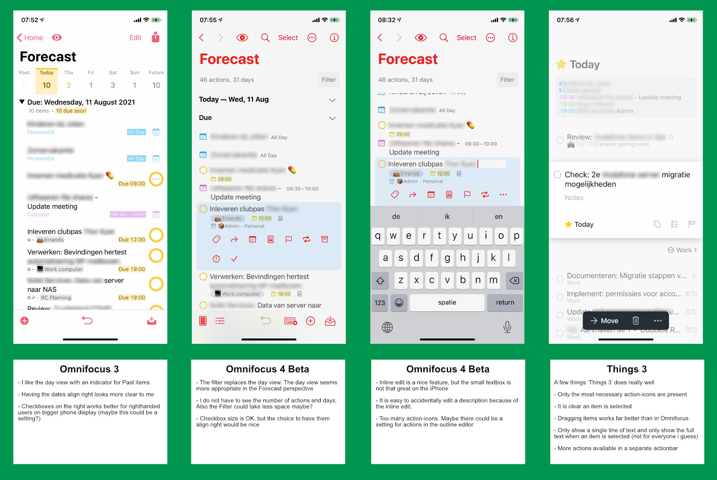
I made a quick overview of thing I (dis)like in the Forecast view. Some of the also apply to other views. I also added a comparison with Things 3, which is also not perfect, but does set a standard for usability on the iPhone.
My hope is that the Universal app development will not have too much impact on the MacOS version of Omnifocus. This is what I mainly dislike with Things 3: it is great on iOS, but the MacOS app could be better in functionality/usability.
4 Likes
I emailed them feedback of many of the exact same things as you pointed out here. Please email them too. 👍
