OmniFocus for iOS, stuck on iOS 7?

I think OmniFocus for iOS got stuck on the iOS 7 design paradigm.

The UI still looks too barebones, too thin. It lacks contrast. There is too much white around. And something that sometimes worries me… it lacks delight.

The functionality it’s there. Other apps are no even close. But, I think there is a lot of design work to be done on the UI.

Take a look at apps like Todoist or Things… There is such much thought for details. No color, shade, or icon gets overlooked. With subtle use of color they establish hierarchy. Even on the Apple iOS settings app there’s more contrast between the sidebar and the main area. Between background and foreground sections, buttons and elements. There’s more contrast between sections in the Mac app than on the iOS ones. Sidebars are gray, they take a subtle shadow of the color, etc.

There are a lot of details to work on. And they matter! They bring delight to the user, make things more friendly and easy to use. They make the overall experience better. iOS design has move on forward. OmniFocus for iOS has not.

Anybody else has noticed this? What do you guys think?
2 Likes

The iOS and macOS versions have gone through their UI changes. The gamut has been run from glaring colors to colors that you could set on your own to pastels. I personally think the UI on both platforms as it is now is better than some stages in the past. Could it be improved … certainly. But who decides what “improved” really means? Search this forum and you will see long threads on the pros and cons of the design changes made going from version 1 to 2. Who set the standard moving forward …???

My own observations FWIW suggest that OF is more conservative than cutting edge in what it offers for UI. The pros are that one can learn the UI so that it does not “get in the way” of being productive. The cons are that some changes that are less than productive get stuck for whatever reason.

Ultimately, as a counter to your assertion in the title, I would not say that OF is stuck in iOS7. I might indeed challenge you to tell us exactly what you would mean by the converse statement to your title … OmniFocus for iOS, NOT up to iOS10 standards. Then, we might anticipate being the starting point of the referenced thread on the pros and cons of UI changes that OmniGroup should make going from version 2 to 3 of OmniFocus.


JJW

1 Like

Check out: Redesign UI/UX for OmniFocus [Things 3]

Just seeing this thread now. I just wrote this today in another post… I’ve pasted it below. Here is a link to the original: Redesign UI/UX for OmniFocus [Things 3]

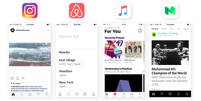
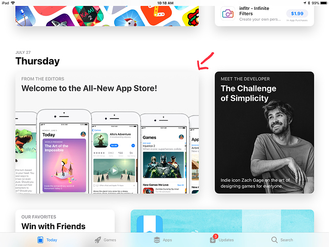
I moved away from OmniFocus back when Things 3 came out. I do graphic design for a living so this decision was largely based on the UI of Things 3 vs OmniFocus. Within the first 5 minutes of gaining access to the Things 3 beta I said “This will win an Apple design award this year at WWDC”. Low and behold it did… The design is absolutely stunning. It’s simplicity combined with it’s beautiful animations make it, in my opinion, one of the most beautiful apps on the Apple platform (both iOS and MacOS). With that said, OmniFocus still reigns supreme as the GTD powerhouse. Nothing else comes close in my opinion. One of the big problems I have with OmniFocus is it’s design and UI. I’m really hoping they consider a complete redesign with OmniFocus 3 both on the Mac and on iOS. I think their icons are cheesy and remind me of the early 2000’s. Also, the bondi blue (or teal) color they use for perspectives is nasty. It’s like the Miami in the 80’s of the software world. I also think the sidebar on the Mac is very ugly. When compared with the Things 3 slide over it’s painful to look at. I hope Omni follows Apple’s lead (which they usually do) and starts designing the OmniFocus UI to fall more in line with where iOS 11 is going. The app store cards are beautiful and delightful. The Apple music app also does a good job in this regard. Even non Apple apps like AirBnB are beautiful in their simplicity. I don’t buy into this idea that a clean design means you have to sacrifice power and feature set. I think software should be delightful to use. It should make you happy. The more beautiful the design, the more likely you’re going to want to browse your action lists. It’s no different than getting into a beautiful Tesla makes you want to hit the open road vs getting into a 2003 Honda civic. For the people who say UI doesn’t matter much, would you rather have the look of iOS 6 vs iOS 11? Design and UI matter, in a huge way. When OmniFocus got redesigned for iOS 7 it was awesome. A striking contrast. I think it’s time to do that again with iOS 11.

The other big reason I moved away from OF to Things is how they treat your due/today tasks. In order for you to have your daily list show up it either has to have a due date or be flagged. I like making a short list for the day of what I’d like to get done without every being “due” or having to have a flag. This is where Things 3 excels.

To conclude I can’t wait to see so of the major changes coming to OmniFocus in Q4 but I really hope they go back to the drawing board for a complete UI overhaul.

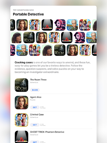
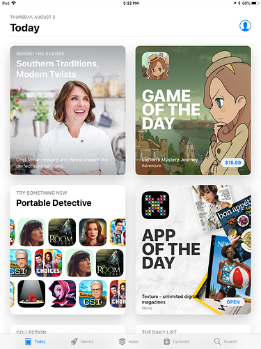
How great would it be if Omnifocus took on a design similar to the card like designs in the new App Store on iOS 11?

Personally I’d hate that sort of design. To me it’s confusing. I want plain straight text in sizes I can control in colors I can control with as little white space as I can manage. No pictures or icons at all.

1 Like

I’m not so much referring to pictures. No icons at all isn’t going to happen as that is a huge cornerstone of software going back to the original GUI of the Mac.

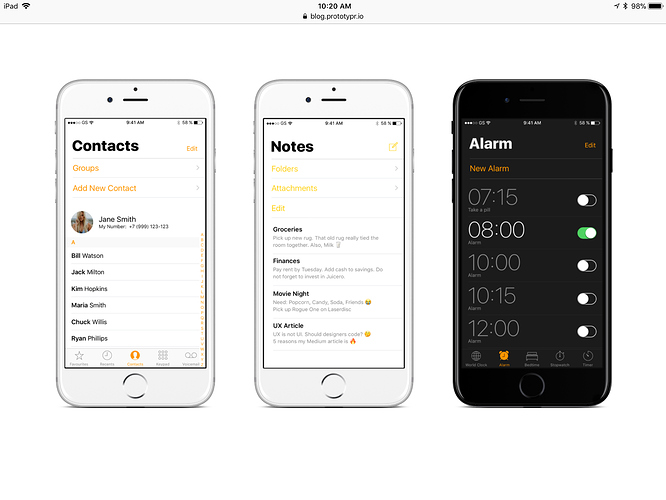
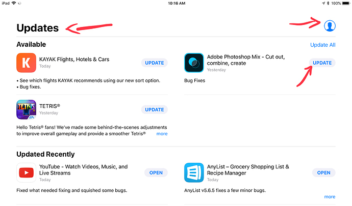
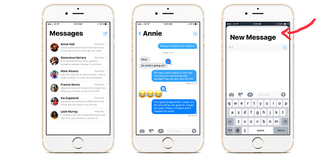
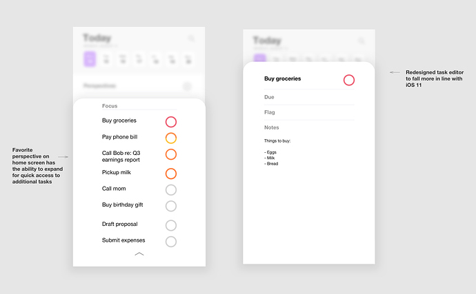
What I’m referring to us pushing the design of the OmniFocus UI forward as to catchup with where Apple is heading with iOS 11. @kcase and his team did this with iOS 7. I’ve posted some screenshots below to help illustrate my point. Consider the compose window in Messages for example. Keep in mind I got this from the web so it could be concept but I know iOS 11 looks close to this. See how the compose window pops up like a card? It’s delightful and simple. Doesn’t mean it has to be less powerful in any regard. iOS 11 also uses more rounded edges for arrows and rounded corners for rectangles. We also need more animations. With each new developer beta for iOS 11 you are seeing Apple add more delightful animations in the control center. Omni could learn some neat tricks here.

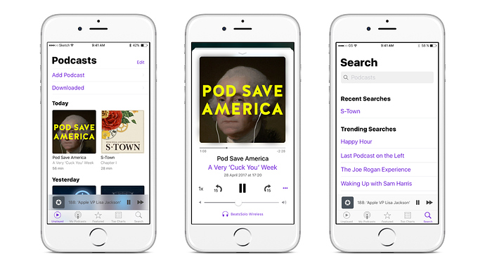
I found another mockup to help illustrate my example. This is an iPhone 8 concept but look at the round corners at the top of the screen. This seems to be where everyone is heading in the latest mobile design trends for iOS. It would be amazing to see OmniFocus head in this direction as well.

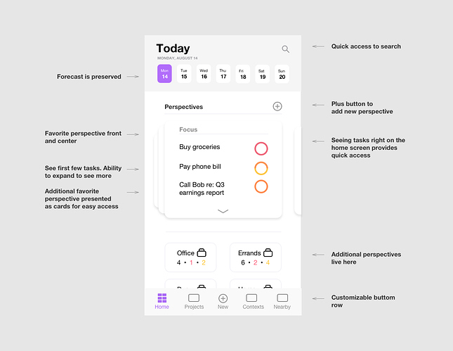
I played around with a mockup idea this morning of the design changes I have in my head. Pleas keep in mind this is a just a concept put together in under an hour and it’s very crude and rough. It’s not so much where things are laid out or that we have cards or no cards. It’s more the design language that I’d love to see moved forward in OmniFocus. Things like rounded corners, rounded edges on lines. New, more beautiful icons. Better use of their core color, purple. The icons on the bottom are all the same as I didn’t want to spend day on them but I think Omni could come up with some new beautiful icons that more reflect iOS 11. I think the home screen could potentially give the user access to their first first tasks of their favorite perspective right away without any additional screens.

Now one important thing to note is that while I think the design and UI should move forward, I am not proposing taking away any features. Just making them cleaner and most accessible. The OmniGroup is very clever with things like holding the back button to take the user back to the home screen from wherever they are in the app. I would love to see more clever UI tricks like this. Things 3 has some clever ones such as the magic plus button and pull down to search.

The one thing I couldn’t get across in my super crude mockup was animations. Moving around the app should be delightful. Moving around Things 3 is amazing. It’s fun and makes me want to dig through my task list.

I’d love to get some of @kcase thoughts here.

3 Likes

I personally hate animations, rounded corners are irrelevant as well. I want things to work well. Most of the make things pretty stuff IMO makes things much harder to work with. For example in your example on the messages, I prefer to see what went before when responding, a card that pops up and blocks out the previous info is a step backward in my mind.

You already have the custom perspectives on the home screen, at least I do. I have a bunch of them in a nice readable scrollable list. I don’t understand the numbers under the perspectives. They make no sense to me.

One difference is that my perspectives are rarely focused on tasks but on groups of projects. A lot of what you are doing is handled by me by setting contexts not perspectives. I can already set my phone to show a particular context and the tasks are right on the home screen when I bring the app up, so again I’m confused as to what you are trying to do.

Your example of perspectives has what in my world would be tasks in totally different contexts and I’d never see them at the same time. Buy Groceries would be in the context of the town where the grocery store is, pay phone bill would be in my desk context, pickup milk might be in a town where the farmer lives who has the cow I have a milk share with, draft proposal would be in the application I use, probably Scrivener, Submit expenses would most likely be in the context of Computer Internet.

Also, with my eyes the fonts are relatively too small with too much white space. I’d want them bigger. Buttons should be larger too, I’m at the limit of hitting what I want to with the existing stuff and new apps often make things so small I can’t even use them well. Accessibility options are a limited way to help but often ineffective.

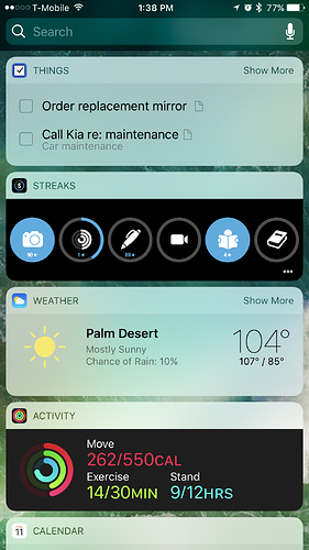
So it looks like you completely disregarded my statement of a 45 minute crude mockup. I’m guessing you are not a designer or are not into design because people who say I don’t care how it looks don’t consider design as being at the forefront. I’m sure you probably also didn’t like the jump from iOS 6 to 7. Saying “rounded corners are irrelevant” is like saying the color of a cars interior is irrelevant or how much work Apple puts into it’s packaging. The user experience is by no means irrelevant. This forum post is about UI and design, not geeking out on how many different ways you can sort a perspective. The numbers under each perspective was showing how many available, due and overdue actions that particular perspective might have. I took the design from OF’s own iOS widget. Again, this is a mockup that took 45 minutes. It’s all about how the user can maintain quick access to information while moving the design and UI forward. Some could even argue that placing more information (in a thought and clever way) on the home screen could give the end user even quicker access to that information. Everyone gets their knickers in a twist when they think that someone is talking about taking away features. That’s not what is being purposed. It’s how we can take those already useful features and push them forward.

There are a lot of people on this forum who just want to geek out on GTD and how they setup their workflows. That’s fine and great but this forum post isn’t about that. Go take read through @awd original post and you’ll see that.

Great design to me is not about “decoration” but about “communication”. And while I think your intentions are in the right place, some things are simply decoration.

Things like rounded corners, rounded edges on lines. New, more beautiful icons. Better use of their core color, purple.

For one, I don’t care about cards or rounded corners, if they do not enhance the user experience. Although even Steve was famously an advocate of rounded corners, in your very nice mockups they do not fundamentally alter the user experience. It is not easier to discern individual elements, you cannot navigate faster with rounded corners, etc.

Then: what do they really add?

Secondly, while I use custom perspective icons, I guess you’re correct that OF could use prettier icons. But yet again: will this significantly alter the way we work with the app?

I won’t dispute that a more aesthetically pleasing interface will evoke more delight. But frankly, I’m here to get stuff done.

To be entirely honest: I very much like the design language, the visual idiom of your mockups. But every design decision needs to be viewed through the lens of productivity (for OmniFocus). Does this help me to complete more tasks in a streamlined way? If not, then we’re not really living up to the promise of the app.

As it stands, I think the iOS version, while not the most gorgeous app in the App Store, does help me complete tasks quickly and reliably. And I’m not saying there isn’t room for improvement: there is, absolutely.

But shifting to a new design trend is not the best answer.

But you see that is just the point of this forum post, beautiful design. So what one person considers purely “decoration” or irrelevant, others consider thoughtful and useful. This is a mock-up, not an actual design. Just because it may look nice in some places doesn’t render it a pretty plain decoration. Everyone seems to want to argue the case that “well if it doesn’t help me get things done faster then who cares.” But again, that’s not what this post is about. You think scrolling through 25 custom built perspectives on iOS as it currently stands and having to drag it to the drop helps with productivity? No, it doesn’t. So it needs to be re-thought.

If people (and the Omnigroup) didn’t care about the way their software looked they wouldn’t let people customize OF the way they do on MacOS with fonts, colors, layouts and icons. And there also wouldn’t be a ton of forum posts pertaining to the topic of OF themes for MacOS.

I’m also not sure why everyone keeps getting caught up on rounded corners? It was something I included in my design because it’s where Apple is headed and the Omnigroup has always strived to keep their apps within the design guidelines that Apple publishes. They have said so themselves. Rounded corners or no rounded corners. It’s not really the point. And what I’m proposing is a redesign to the home screen (not mine, anyone’s) that would allow quicker access to information and eliminate as much friction as possible for capturing, clarifying, organizing, reviewing and doing. Cards or no cards, I want beautiful design with a thoughtful, updated and streamlined UI. Not just for the home screen but for the entire OF platform. Because it’s awful the way it is? No, absolutely not. Because design and UI should always be pushing forward and asking questions of itself. This applies to both form and function.

@awd said at the beginning of his post: “The functionality it’s there. Other apps are no even close. But, I think there is a lot of design work to be done on the UI.”

I’m glad you’re here to get stuff done. We all are or we wouldn’t be using OmniFocus or having a discussion about it.

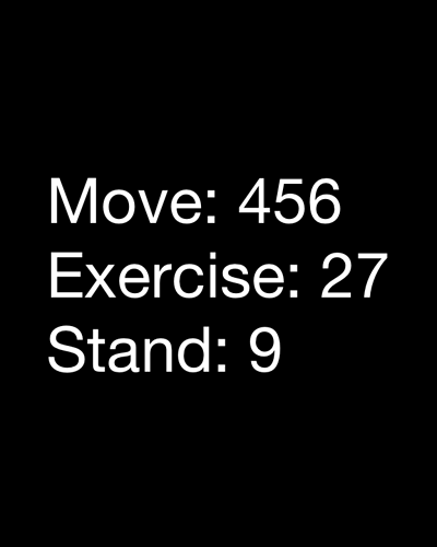
Apple didn’t have to create the activity rings on Apple watch to be beautiful and thoughtful. One could argue they don’t make someone more “fit” or “healthy”. But they “did” make them beautiful and thoughtful. Why? Because they sweat the small stuff, the details. Everyone decision matters. And it’s why they are the most valuable company on the planet. They care about the user experience. I’ve posted two examples below. Which one would you rather have on your wrist while working out? I’m not saying that the Omnigroup doesn’t care or value the user experience. I believe they do. But again, let’s not forget the reason why this post on the forums exists. It’s to discuss great design and UI and how those two things go closely together. I don’t accept the notion that it’s an either or proposition. Everyone keeps saying “pretty icons are irrelevant” “If it doesn’t make me more productive then who cares”. But the fact of the matter is, it does matter to some. Some people do care about the way things look. Does it make them “less” productive in the eyes of people who just want to discuss GTD porn? Maybe, but at the end of the day I don’t care. I like put high value on the way things look. It’s the reason I use Apple products.

This is an unsupportable argument for certain. The counter statement to it is however an absolute imperative. If it gets in the way of getting things done, everyone must care.

When I have to look inside a box to read a list, I haver realized, my mind works harder. Yours probably does too. (I believe it is a proven fact in UI design). Alternatively by example, I only need to post examples of the multi-colored, thickly bordered tables that my engineering students are so proud to make (because such a “design” is so clever and hip and the latest fad don’t you know) and then post the counter examples that they create when I train them to clear everything out (perhaps in LaTeX rather than … cough cough cough Excel cough cough cough …) to showcase the principle I am making here in action. Grant the extreme and you must grant that it has fundamental reason. Grant the fundamental reason and you must grant that it can also apply even in the most subtle of cases.

The rounded corners emphasize that contents are inside a box which itself is inside a physical frame (of the iPhone). The box is an additional layer that my mind (and yours) has to process “to get past” to read the contents. Pretty as the box is, it is ultimately a distraction to read the straight-up display of the information immediately and directly. To put a silly analogy to it … the rounded corners only emphasize “this is a box … read me first!!!”.

Ultimately from all of this, I would argue --> get rid of the rounded corners (if not the box itself).

Now perhaps the reason why everyone has focused on the rounded corners comes out.

As to the rest of the back and forth …

I have learned, when I post an idea here, I should be prepared to have it torn apart. It is not personal. It is in the nature of how some forums operate. This happens to be one such forum.

You can spend a lifetime arguing your case by telling the counter posts that “they must be missing something or not realizing something or doing something wrong”. At some point, you might just need to realize that folks just do not accept the idea because they just don’t, and it is not personal.


JJW

3 Likes

I’m a programmer and a farmer. I care about what works. For me actual performance is key. I see user interface design as critical only to the extent that it helps me function and that is how I write my own programs for my use. I truly don’t particularly care if it’s “ugly” as long as it works the way I think and doesn’t get in my way. Then again ugly is in the eye of the beholder and so is pretty but if a feature or design change doesn’t help me function then I consider it useless in a tool like Omnifocus.

So from my POV the things I’d much rather Omni focus on would be things that will enhance the tools functions. Better ways to define repeating tasks, more tools for contexts, better/finer integration with location based contexts for those that use them and so on.

It also is almost certainly a difference based on whether you are more comfortable getting information primarily from a reader/text based system vs a visual/picture based one. I am most decidedly NOT visual/picture based. Most of the engineers I know are like that.

That bias is also why I think that making things pretty from a design POV is a waste of time. There is only so much programming effort you can apply to any given program and I’d rather see it applied to things that matter to me, the functional changes I wish were implemented. Design, icons and colors do not really matter to me. I understand on an intellectual basis that they do to some folks I just have a very hard time getting concerned about it so long and the system/program/device works flawlessly for my needs.

I think we have probably reached an impasse here.

I much prefer the top text based picture. To me it’s clean, simple, there are no distractions, it provides accurate and specific information in a format I can readily understand. I can easily collect that data and run a larger system analysis on it over time because it can be easily mathematically compared.

I have a hard time interpreting the colorful semicircles. How much time are they representing? Or is it even time or what is the unit of measurement? How accurate are they? What if I want to track my progress over time? How can I correlate the data? How do I save, edit, and interpret it?

For me there is no basis for any long term usefulness of the colorful rings so they are actually not helping me at all.

The rounded corners don’t constitute an additional box. The home screen I proposed has no difference to how OF currently functions except you might see a few tasks from the perspective of your choice highlighted at the top. One could argue you “are more productive” because those top three tasks are right in your face upon launching the app. Your favorite perspectives would still all be there. Saying the content is inside of a box makes zero sense no matter how many fancy words you try to fit into your argument. Every time you switch screens or lists inside of OF you are going into a new box. Software lives in boxes. I am typing in one right now.

I have no problem with people disagreeing with my point of view. I don’t take it personally. Defending ones position isn’t me taking it personal. I’m just not into people saying ridiculous things like "rounded corners make one feel “boxed in” or “another box one has to get past?” Good grief. That is the most ridiculous thing I’ve ever heard. Software is nothing but boxes on boxes on boxes. Trying to go that deep and get that theological about a list manager is comical. I am simply presenting some visual ideas (which no one else in this post thread has done thus far) and people get hung up on rounded corners or “feeling boxed in”.

You’re right, I can spend a lifetime arguing my case because 1. I enjoy it and 2. I am passionate about OmniFocus as it makes my life better and I want to be someone who presents ideas to help drive it forward. I don’t want to be someone who simply stumbles into a discussion thread with a topic that they clearly don’t care about and start saying that UI and design don’t matter.

Again guys if you don’t care what things look like then why are you in this thread? Seriously. This isn’t a discussion about “pretty things are useless” or “if it helps get the job done who cares”. This thread “is” about how OF looks. Go create another post to talk about your command lines and deep theological software prisons.

The screen below would theoretically make everyone feel very boxed in with all of that useful content or information inside of all those boxes with their rounded corners.

I’m in the thread because I think software goes downhill when developers worry more about how things look than they do about adding useful features. To me, given the always tight development budgets and the increasing competition in all areas, I see making it pretty as a waste of precious resources when there are so many other features and enhancements that could dramatically help get more users.

So I argue against worrying about the looks in favor of making sure it’s fast, efficient and does what more and more users want.

When developers focus on looks you get beautiful according to some people software that is dead in the water. I don’t want that to happen to Omnifocus.

2 Likes

This post was flagged by the community and is temporarily hidden.

This is what I said in summary …

  • In the current design of OF on iOS, content run from top to bottom and left to right, filling the entire physical frame of the iOS platform.
  • The placement of content (that currently fills a physical frame) within “cards” creates a box around the content. My mind (and I dare say yours and everyone else’s … and I believe this is proven scientifically) has to process the additional information to get past the additional box in order to recognize that its contents are more important than the border around them.
  • The additional processing is a distraction rather than an improvement.
  • Rounded corners accentuate the effect of having an additional box to read through.
  • Rounded corners accentuate the distraction.
  • Rounded corners (if not the entire “card box”) should not be used.

Passion is fine until it becomes blind (as demonstrated perhaps by the above) …

… or self-rightuous (as this is might be tending).

I respect that you have a passion to improve the design and the skills to demonstrate your ideas clearly. Unfortunately however, as others have stated, this thread has now reached an impasse.


JJW