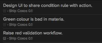
I like the new look. When I synced over my data from OF1, there were a few items which had notes attached. I have seen that the notes icon changes from a flippy arrow to a plus sign. However the icon is not particularly clear and I think it would be beneficial if they were a little more obvious.
The notes icon does darken a little, but not enough to stand out.
also, the itsbitsytiny “+” turns into an itsybitsytiny rectangle ;-)
I will admit I was a little dismayed at how poorly notes show up in OF 2. A repeated gripe of mine from version 1 was how easy it was to miss important information embedded in notes, and how unreliable the “Show all notes” toggle is. This severely compromises OF as a “trusted system”, at least for me.
There should be an option to always show all notes globally. Some of us would always like to see the notes associated with our tasks. At the very least, the icon should be prominently colored (red?) when there are notes available.
I’m really hoping this hidden notes problem will be solved by the time OF2 is released!
+1… why not?
I agree, it’s really difficult to see when something has notes. The gray between “no notes” and “notes” is extremely similar. I’d prefer something much much dark.
Sorry, that’s a bug: you should be able to scan for notes just by looking for the presence of a notes icon.
The gray “notes plus” icon is only supposed to show up when you mouse over or actively edit a row (just like in OmniFocus 1 or OmniOutliner 4), but clearly it’s showing up more often than that at the moment!
Or perhaps I’m mistaken!
There does seem to be a bug in that they’re showing up more than they should, but I just learned that the design calls for them to always be visible when there’s a project or context visible. They’re there to help anchor the beginning of that line so it doesn’t feel out of place with respect to the task name above it.
That said, we’ll take another look at this: we definitely want it to be easy to quickly scan a list of tasks for the presence or absence of notes.
If you see a post or idea you feel is valuable or want to add your support to, please use the “Like” button (it looks like a heart) on the original post. Discourse uses the like button to try and ensure that useful topics are surfaced and stay visible. +1 posts don’t have the same effect.
I find it very hard to tell if an item has notes and I often add an * to the action title, because I don’t trust that I’ll see the note. With the dark theme, in either layout style, it’s hard to see the change in the note icon. However, I’d say it’s particularly problematic when using the custom columns layout on a widescreen, which I do. You can see this in the first image here.

Are there any changes to this coming in the 2018 release?
