Something we all share in common, I think, is a real love for OmniFocus. The power of the app enables all of us to craft task systems that suit our individual needs. I don’t know about you, but I feel a real personal connection to the app and the system I’ve built within it.
But I also think a lot of us continue to use OmniFocus despite some of its aging design choices. It’s not bad…but in addition to my own pet peeves (like no way to tell what perspective you’re viewing on iPad), I’ve seen more and more discussions here and elsewhere comparing it unfavorably to more modern-looking (but less-capable) apps like Things.
So I wanted to explore what a modern, cross-platform OmniFocus experience could be like, and wrote up a design study: Let’s Fix OmniFocus - Design Study
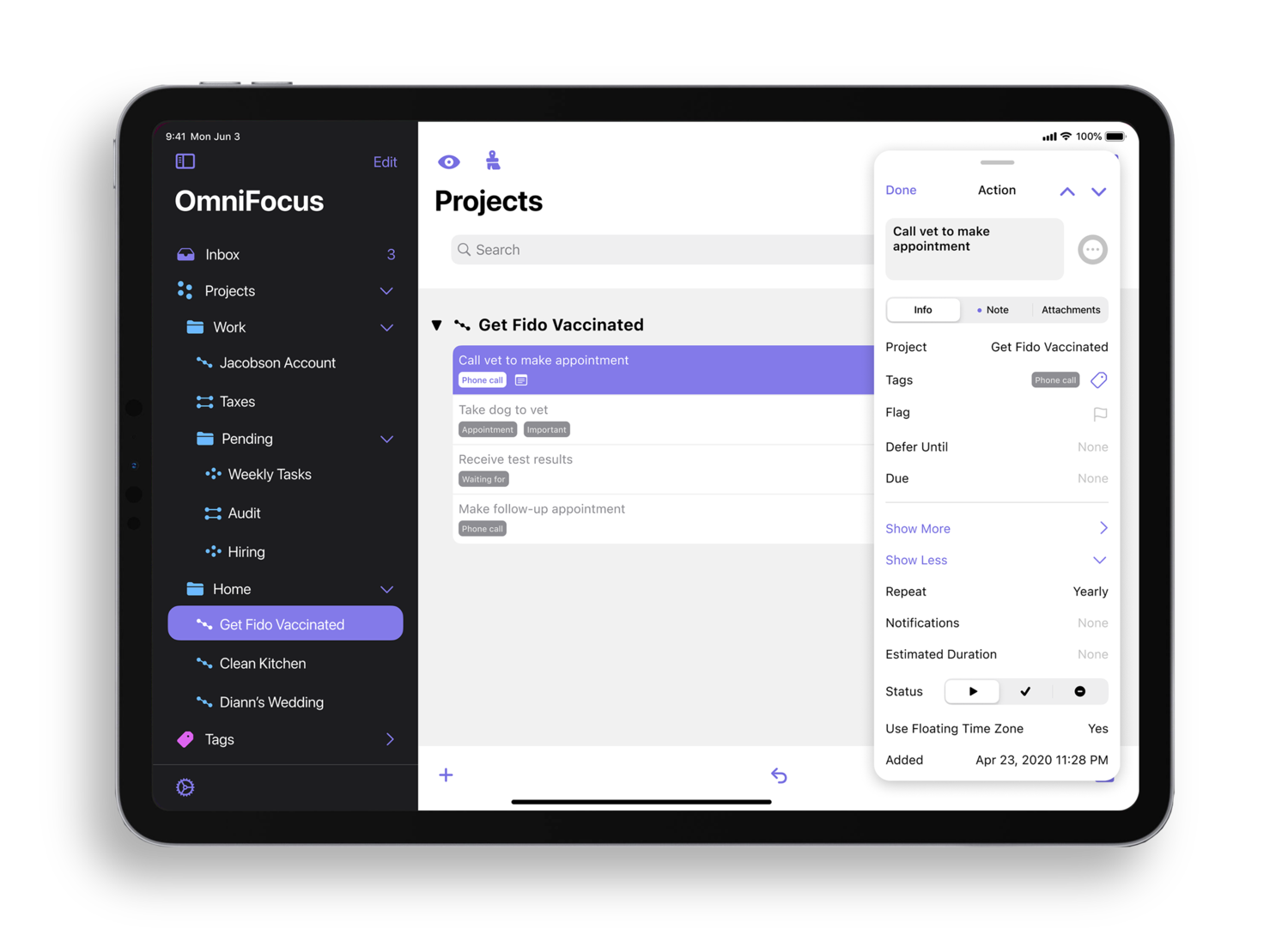
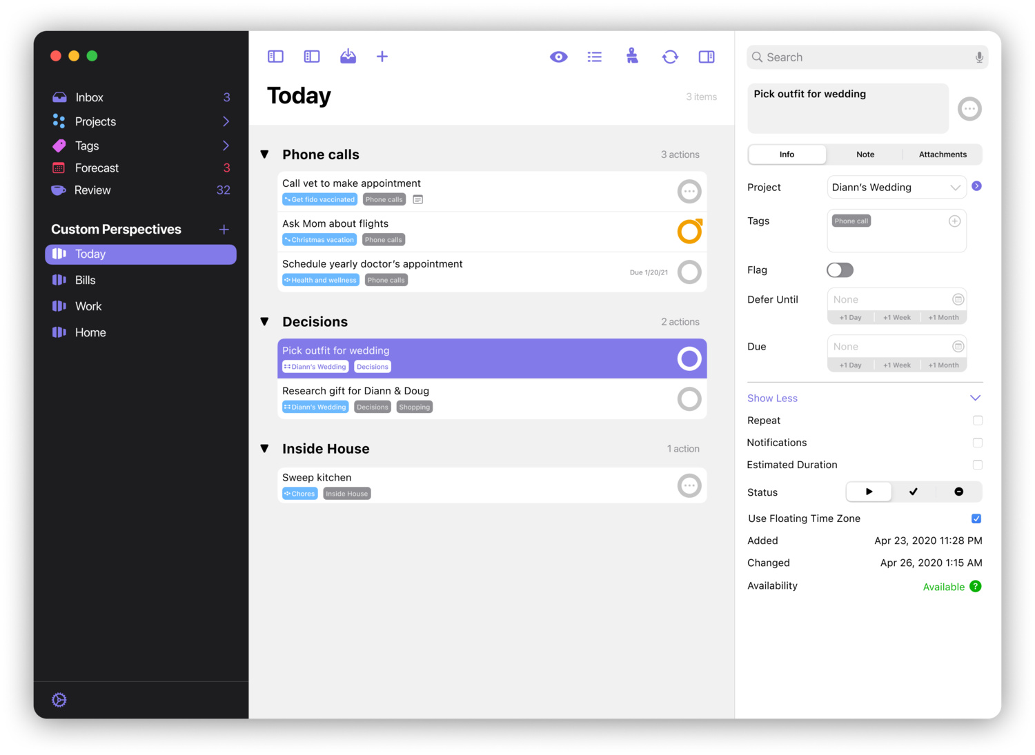
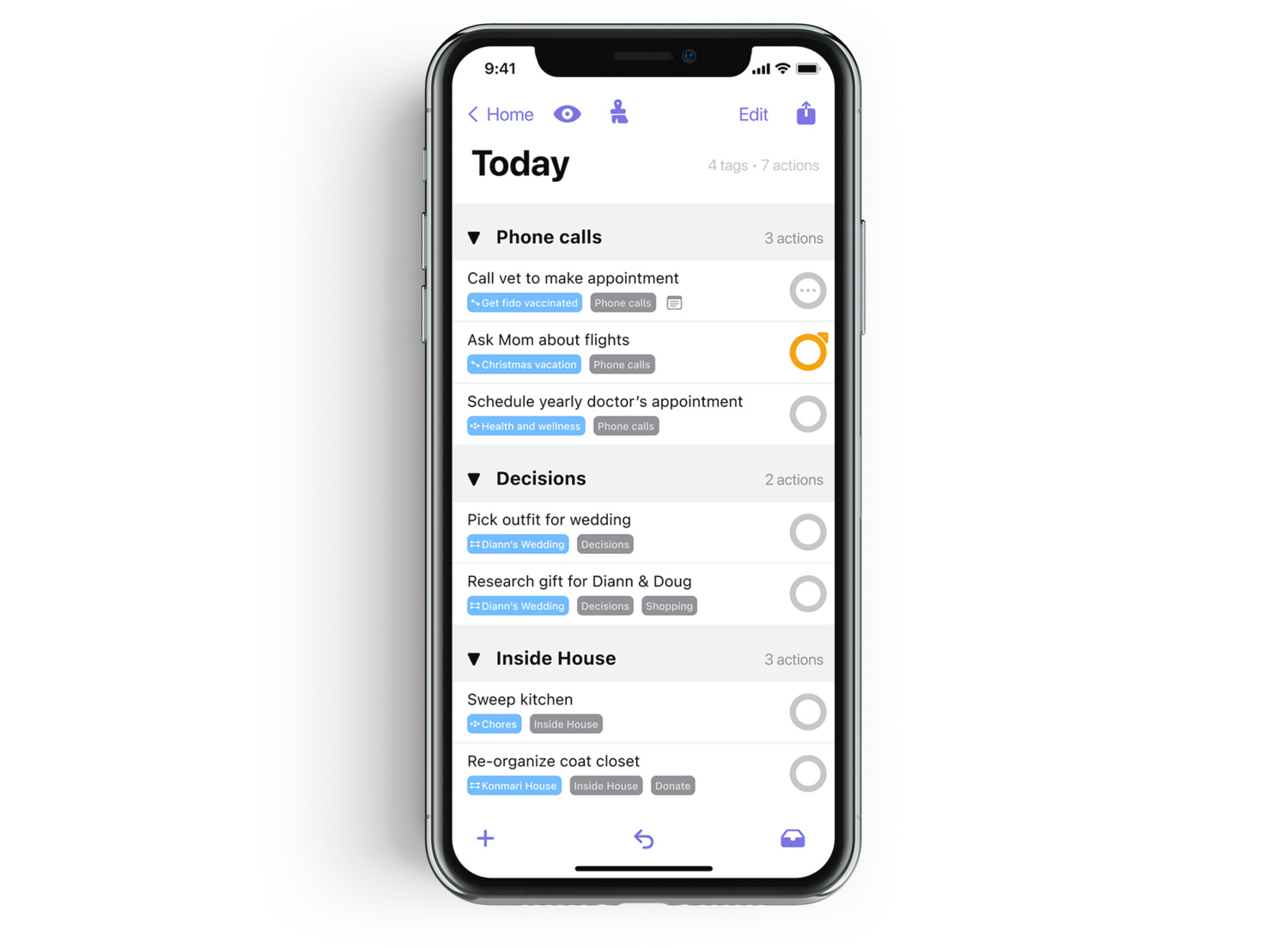
If you don’t feel like following the link, there are a few screenshots from the study below. But much of my reasoning is in the article.
I have no doubt many of the choices I’ve made will be contentious. But I was getting tired of seeing so many hypothetical discussions without anything concrete to observe. I’m hoping to at least spur a conversation around what continues to be one of my favorite and most important apps.
This is great - I love the focus on the iPad given that it’s my preferred device to triage email into OF. If I were Omni I’d adopt your ideas wholesale and pay you a few thousand bucks for the consultancy services you’ve provided them.
Some of the worst ratios of signal-to-noise, and the highest peaks of visual incoherence, are concentrated, however, in the raucous and motley company of icons which disfigure the thing.
The blue ball-and-stick stuff, for example, is much more noisy than is needed for the semantic work it actually does. (Far too many redundant edges for the eye to respond to and decode at a glance).
How many different visual languages can we count in that side bar alone, before we even start with the eye and octopus (or ‘brush’ picture) on the top line ?
(For some reason the nadir for me is the ‘perspective’ icon. Not just visually noisy and cheesily pictorial, but even requires deciphering a word-play reference to the receding lines of renaissance perspective).
‘Perspectives’ are filters, queries or reports. You have to put yourself in an Anglo Saxon verbal frame to even see the parochial word-play which that rather overwrought and ugly icon depends on. (3D ? receding ? haha perspective --> filter. But do I really have to grind through that joke every time I glance at it ? ).
Speaking as just one former user, I couldn’t really bear to open, let alone spend 20 minutes in the thing, unless those icons were all flushed out, and replaced by one coherent design, which expressed some serious and coherent ergonomic thought – about what is being expressed, and what is the minimum required to effectively convey it, at a glance, without cheesy pictures and redundant lines of contrast.
Nice work. Your proposal looks attractive and is strong in harmonising the experience across Mac and iOS apps.
How do you propose to handle navigating inside deep project and tag hierarchies in custom perspectives?
On Mac, I spend most of my time using my custom perspectives, which I filter on the fly using the tag or project hierarchies, depending on the perspective type. My hierarchies are very important to my use of OF and can be several levels deep. The large side pane for these hierarchies in the OF Mac app thus work very well for me. I’d love to have the same capability in the iPad app, where viewing perspectives with much content is unwieldy.
In your mockups, I see one screen (one of the ‘Today’ views) which has a narrow column containing the tags of the items, but I wonder how this would scale. What about custom perspectives that are project-based: would the hierarchy be displayed in the sidebar like for the built-in Projects perspective?
@MultiDim Great points. Yes, in my mind, the secondary sidebar on the Mac would work for both tags and projects - just as it does today. I use it a lot too.
I hadn’t considered extending that UX to the iPad – but I think it could likely work in landscape mode – though I think on anything less than a 12.9", it might get tight.
Part of the problem with the current OmniFocus style, in my mind, is that it’s too flat, and that results in not enough visual separation between sections. Your design at least achieves that separation. Additionally, with the iPad’s screen size, expanding hierarchy in the sidebar (like you show) should be an option. Navigation on the iPad just feels crippled by trying to stick too much to paradigms better suited to a much smaller screen.
I’d also put my vote in for a medium color scheme while I’m here. I prefer dark mode, but with OmniFocus the choice is either bright white or completely black. The black theme doesn’t quite have as much visual contrast as I think it should have; OmniFocus is necessarily information-dense, and sometimes it feels more cluttered than it really is. Switching to light mode actually feels less cluttered, but my eyes (and my battery life) don’t thank me for it. :) A middle ground would be nice to have.
Thanks, Paul. Very well done!
Hopefully I did not oversee something - but are you somehow related/working for Omnifocus or did you do all this in your spare time? It looks absolutely professional and, in the latter case, I hope that your proposals will be heard.
/Simon
Looks great! I hope the Omni team draw inspiration from your work, or better yet, consult with you. From my personal usage, the iPad app needs to be completely rethought. I sadly moved away from OmniFocus a few months ago because the iPad is now central to my life and I just could not cope with the friction in OmniFocus for iPad. I still hope I can come back one day.