I like the new platform overall and feel Omnifocus continues to set the bar in project/task management tools for the Mac ecosystem. Aside from a major shift in how the Forecast perspective works in OF3 v OF2, I find the overall interface busy and asymmetrical. The introduction of very vibrant colors, a new font type and size are really working against other great advances IMHO. The bright colors are constantly competing for my visual attention- which I find distracting - and spacially everything just seems really cramped regardless of settings.
2 Likes
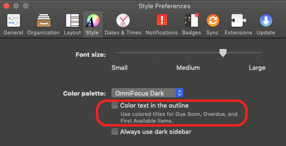
Perhaps turning off “Color text in the outline” will help reduce the rainbow of colors in OF3 for you?
I’ll admit. I rarely use the Forecast perspective but that’s just me.
Turning off both Dark mode and ”Always use dark sidebar” in the dialog box shown by @wilsonng above made a big difference to the better for me. At first, I didn’t like that all the buttons in the left button bar are colored, not only the chosen one, but as I got used to it I found that it helped me with the orientation, especially as you now may set your own colors for custom perspectives.
2 Likes
I agree in what @naheksr wrote: The overall interface busy and asymmetrical.
I have tried playing with the settings to no avail. I am sure I will get use to it over time and will come to like the interface more. I do hope and wish for a new type face font to create better spacial boundaries.
Shame on the Omni Group for not consulting with me before releasing this new interface ; )! Geez
I am hoping too that the Forecast perspective returns to the days of old.
Thanks all for the suggestions.
1 Like
This topic was automatically closed 30 days after the last reply. New replies are no longer allowed.
