I have a large outline with many levels. I would like it to be easier to distinguish quickly between lines that have disclosure triangles and those that do not. The goal is to make it easier for the (old?) user to find the lines that can be expanded further.
Possibilities would include:
Hiding (or at least making very inconspicuous) the circle that marks the lines that cannot be expanded further.
Allowing a preference to place a background color on all lines that have disclosure triangles.
I cannot find options to do either of the above. If it is possible, please tell me. Or other approaches to this problem.
I can see and find the gutter well enough. But the issue is scanning a page and quickly seeing the lines (with disclosure triangles) that permit deeper burrowing into the document. The dots and disclosure triangle handlers are similar enough that it takes more focus than I would like to just travel around though the document.
What I am trying to do is create basically a reference document. In this case of “human body anatomic terms”. The intended user would not be editing this document. He/she would just be traversing it. So the dot handlers are really just noise. As are a number of other user interface elements.
I seem to be trying to force OO into a direction that it does not really want to go: i.e. simply creating a stable friendly document for distribution that users can wander through but not change. A “final product” as it were.
Would you problem be solved by exporting the document to a dynamic HTML file…and maybe fiddling with the CSS to change the size of the disclosure triangles? (I have no idea how easy or difficult this would be.)
Sure, you’d have to re-export the file whenever you change it, but if it’s a reference tool for sharing with others, it also means that they don’t need to have a license for OO to read the work.
Other outlining programs have a setting to show/hide row handles for rows that have no children.
I am just starting with OO, so don’t know why this is not available per file or globally, but it is often useful. Perhaps send in a feature request.
Afaict, you can set any row to not show the row handle. Select the row and then click the appropriate control in the Style Inspector.
I don’t know of a way in OO to select all childless rows. But if you are publishing your document in another format, it might work to simple expand all after your final edits are done, and then manually select each childless row and set it to not show its row handle. (I don’t know yet if the row handle setting is saved as part of the Named Styles; I suspect they are not.)
There are likely ways to effect this using whatever program you use to create your final distributed version (which won’t be in OO3 format, afaict).
You might look into simply exporting from OO to “HTML (Dynamic)”, then going into the exported folder and either deleting LeafRowHandle.png, or editing it to be transparent.
I’ve often wished I could change the size and color of row handles. They become invisible on darker backgrounds which significantly cripples OO’s usefulness when using dark themes.
There’s any easy fix for this. Styles are your savior here. Create your styles so row headers are irrelevant. I do this all the time and my documents look gorgeous so I know its both possible and easy. Granted, it would be wonderful if they actually implemented some of our suggestions but who wants to wait that long?
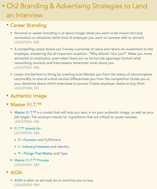
I normally just use Solarized light and one other which are both themes everyone already has. While my documents tend to be quite a bit more colorful than this, the image below is a good example of the principle I mentioned in my last post.
Chapter headings are in their own unique style so it’s obvious they contain child rows without even reading them or looking at the row handles. Section text is in yellow and is also obvious. I use blue instead of bold and purple as a kind of extra bold. Additionally, it’s sometimes more useful to take a body text level thought and subdivide it. Complete lines of text in green represent these concept chunks and, again, the fact that these rows have children is made completely obvious by their styling.
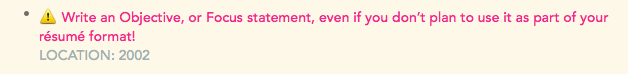
I also make extensive use of TextExpander. For warnings and important notes, I type !!! and TextExpander replaces it with the ⚠️ symbol. The I hit F6 for magenta and start typing.