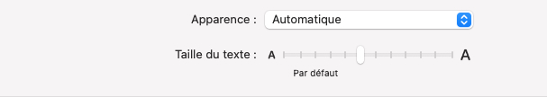
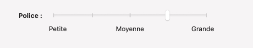
On Mac, in Settings > Appearance, there’s a Font size slider which you can use to scale all the fonts in the outline, including the font used for notes. On other platforms, we scale the entire interface (including the outline and notes) based on the user’s preferred Text Size setting (which can be customized for just OmniFocus by swiping down from the top right to get the Control panel, then tapping on the aA Text Size control and choosing “OmniFocus Only”).
We care very much about accessibility! Part of the problem with the old v2 interface for setting up default styles was that it was very fiddly and didn’t compose well with the newer accessibility features, such as honoring system-wide adjustments to the base text size or between Light and Dark Mode.
In addition to the scalable font size settings mentioned above, we worked with vision-impaired users from very early in the OmniFocus 4 development process (even before the first public TestFlight) to improve the flow of using OmniFocus with VoiceOver, the built-in screen reader for all of Apple’s platforms. We’ve improved accessibility descriptions, default actions, rotor actions, and general navigation through the app to make it easier to use the app without sight.
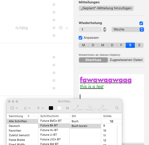
In OmniFocus 4, we also introduced support for dynamically adjusted colors in our Rich Text notes so that they maintain contrast when switching between Light Mode and Dark Mode. (A common problem in earlier versions was that you might choose a color for some of your text in one mode that would make that text hard to see in the other mode.) In OmniFocus 4, if you’re in Dark Mode and choose to make some text light blue, then when you switch to Light Mode the text will automatically become dark blue instead. We do this brightness inversion using the HSL perceptual color space (rather than just naively inverting the values in RGB or HSB) to ensure the contrast is accurately maintained when transitioning between Light and Dark modes.
We’ve had good feedback about the changes we’ve made so far, and continue to make additional improvements as we receive additional feedback. For example, the recent 4.2 release made these improvements:
- VoiceOver — Improved VoiceOver support for Select mode.
- VoiceOver — VoiceOver now indicates when an item is completed.
- VoiceOver — Quick Open button is now labeled for VoiceOver.
- VoiceOver — Flagged state is now announced by VoiceOver.
- VoiceOver — Fixed a bug that blocked subsequent item edits via VoiceOver.
- VoiceOver — Drop target is now announced by VoiceOver when dragging an item.
- VoiceOver — Button selections in Inspector are now announced by VoiceOver.
And the upcoming 4.3 release (currently in TestFlight) makes these improvement:
- VoiceOver — Focus is now always placed immediately in title field when “Edit in Inspector” VoiceOver action in invoked.
- VoiceOver — Estimated Duration units are now read correctly by VoiceOver.
We’ve also made big investments in supporting Voice Control, which lets people perform actions in OmniFocus using just their voice. We’ve integrated this into our plug-in system, so we now have over one hundred pre-made Voice Control commands for OmniFocus, and people can build their own controls.
This is an important topic, and we believe that making our apps accessible benefits all our customers. We’ve worked hard to make the app support scalable text, dynamic color contrast, accessibility for people without sight, and accessibility for people who might find it easier to control a system with their voice than their hands. I believe we’re the first third-party to support all of these accessibility features in our apps, and we have better support for some of these features than Apple does in many of their own first-party apps.
But that doesn’t mean we should stop here. I’ve already noted that we’re continuing to make improvements, and if you think of other improvements we could make that would make the app more accessible please don’t hesitate to let us know by sending email to omnifocus@omnigroup.com.
Thank you!