OmniFocus 4.8 introduces compatibility with macOS Tahoe 26, iOS 26, iPadOS 26, watchOS 26, and visionOS 26. Implementation of new design is currently in-progress.
All Platforms
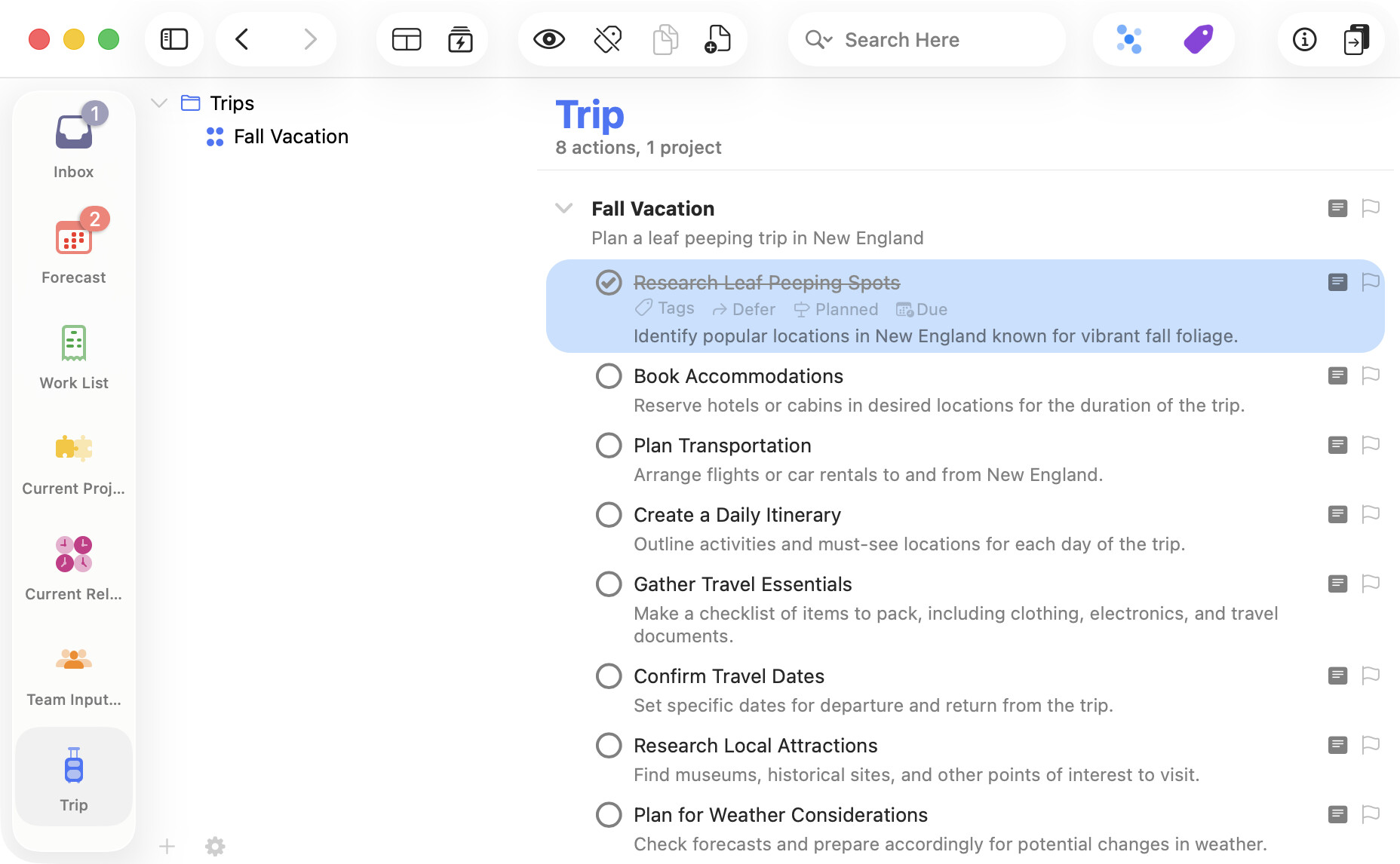
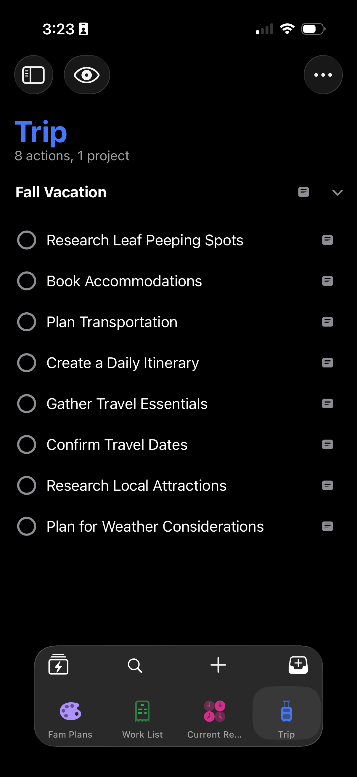
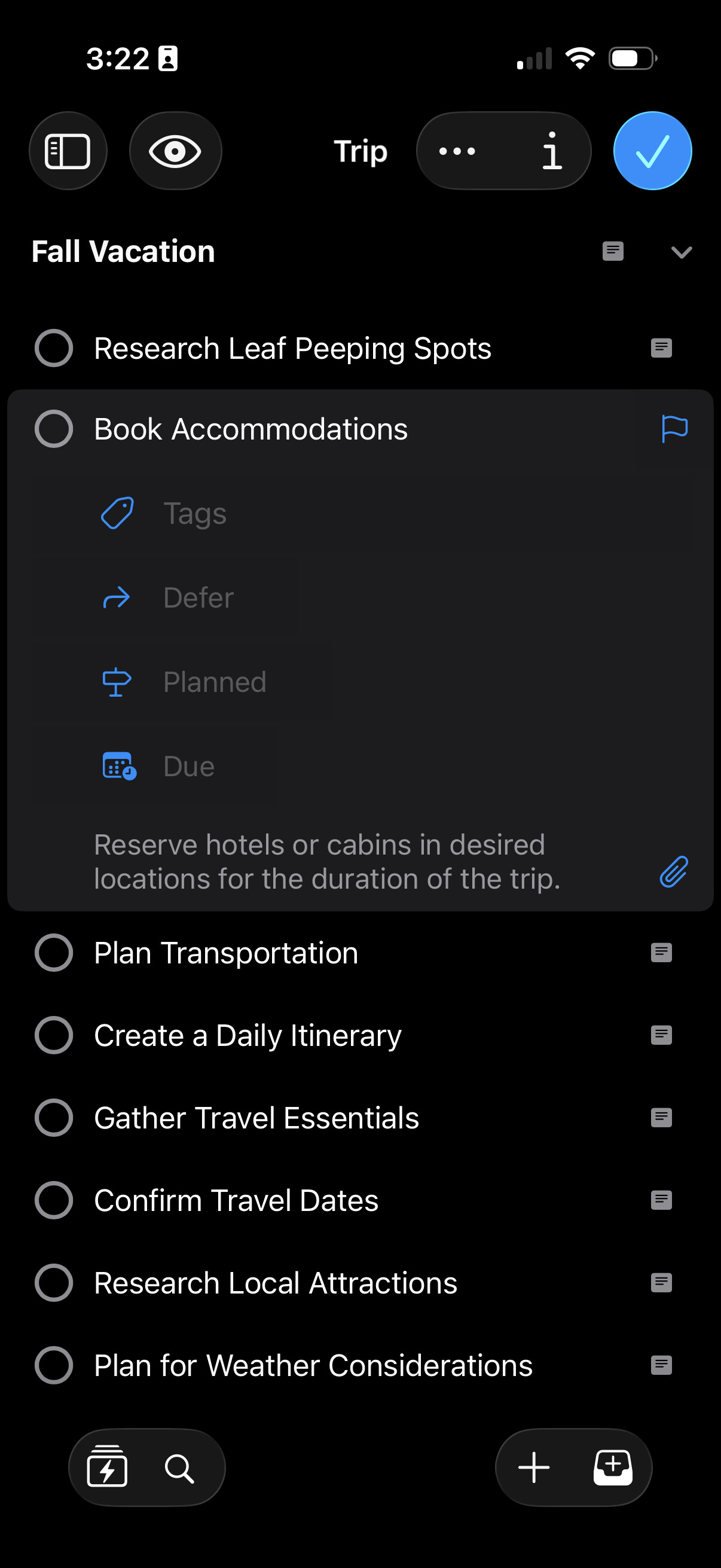
New Design — OmniFocus has been visually refreshed for OS 26, adopting beautiful Liquid Glass design elements and a modernized look and feel when run on macOS 26 Tahoe, iOS 26, or iPadOS 26.
Omni Automation — On devices running OS 26 with hardware support for Apple Intelligence, OmniFocus plug-ins can now consult Apple’s new on-device Foundation Models.
OS 26 Compatibility — OmniFocus has been updated for compatibility with macOS Tahoe 26, iOS 26, iPadOS 26, watchOS 26, and visionOS 26.
Documentation — Draft documentation updates are available in-app and online. (We are investigating a bug opening in-app docs on iPhone & iPad.)
App Icon — App Icon has been updated.
Quick Open — New Quick Open icon.
Mac
Spotlight — OmniFocus Shortcuts actions can be run directly from Spotlight on macOS 26.
iPhone & iPad
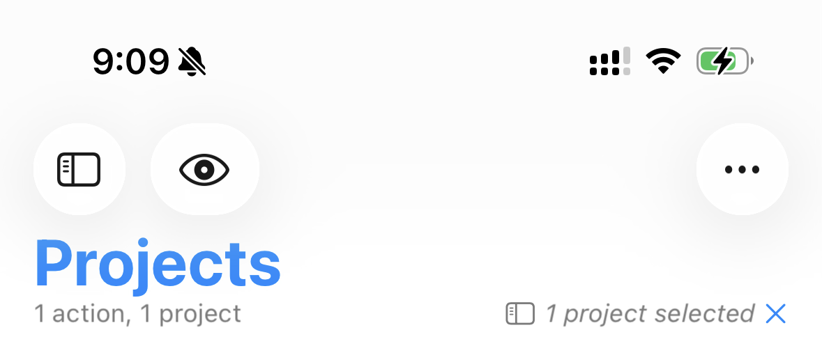
Perspectives — Perspectives are now managed in Settings.
Quick Entry — Quick Entry is now accessed via a dedicated button on OS 26.
Search — Search has moved to the toolbar on OS 26.
iPhone
CarPlay — Forecast and Perspective Items widgets are now available in CarPlay on iOS 26.
Perspectives Bar — Redesigned Perspectives Bar now collapses on scroll, providing more space to view your tasks on iOS 26.
iPad
Windows — OmniFocus windows fully support flexible windowing on iPadOS 26.
Menus — iPadOS 26 Menu updates are in-progress.
Apple Watch
Control Center — Quick Entry and Open Perspective Controls are available on watchOS 26.
Apple Vision Pro
Widgets — Forecast, Perspective Items, and Quick Entry widgets are available on visionOS 26.
@kcase I wanted to know your thoughts on this spacing in red; is this work-in-progress or is there some limitation developers need to contend with? This is jarring.
Also, the highlight is not spaced/ rounded properly - it rounds too close to the text - as evidenced in Forecast. Maybe the curvature could be reduced?
Next, while it is not an issue, but could the icons above the tiles be separated from the bottom bar and split - two to the left and two to the right - while keeping Liquid Glass treatment?
Thanks for the feedback! I’m sorry if this feels jarring right now; hopefully with more exposure to the Liquid Glass design language of the entire system it will start to feel less so.
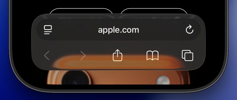
Specifically, the OmniFocus 4.8 navigation bar is designed to fit in with what we see in Safari when using the Bottom bar:
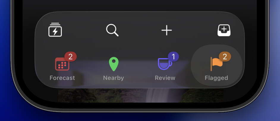
Part of the Liquid Glass design language is that the curvature should be concentric. So the selected perspective highlight here is concentric with the curvature of the corners of the bar, which is concentric with the curvature of the device:
As you can see in this screenshot, the perspective icon falls in the center of the selection highlight, with the title as an annotation below and the numbered badge as an annotation on the trailing edge above.
We experimented with that, but it felt a little noisy—and the current approach gives those icons bigger tap targets.
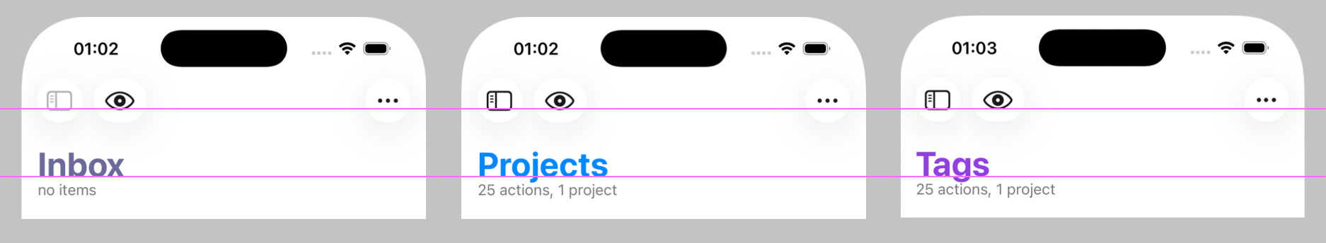
Hmm, are you scrolled to the top of all of those screenshots? OmniFocus tries to remember each perspective’s scroll position, which can leave their headers out of alignment. But if you scroll to the top of each, they ought to be aligned:
(Maybe we should automatically scroll perspectives to the top when restoring a perspective’s scroll position that’s near the top, to prevent this sort of casual misalignment from being restored and giving a bad impression?)
Thanks for digging into the details and sharing your specific concerns!
That is thoughtful, indeed. Will take bigger tap targets any day. And hey, cool translucency! Looking forward to it in some build! In this translucent state, the merged buttons do not look odd at all.
This might be nature of beta OS and beta app or anything, but as I had never seen this issue before, after reading your message I launched the app and manually scrolled down all perspectives. Everything is in line since then. Now, even if I try, I cannot create the gap as I provided in the screenshots!
One quick thought regarding the Perspective Bar:
Previous behavior (up till 4.7) was that the tiles would stay in position until slid, no matter which perspective was chosen (from the 4 onscreen).
Now, the new behavior is that selecting the third perspective (Tags, in default setup) changes the position of the tile to second place, revealing the Perspective that comes after Forecast. This creates a little muscle-memory issue to begin with, and in general, does not really feel elegant at the moment.
Knowing how deeply Omni Group thinks through design choices, I am sure this might simply be a starting point to something better that adheres to the new changes in iOS 26. How are you feeling about this?
Thanks again for taking the time for an elaborate explanation, Ken! Much appreciated and the insights into the team’s design choices are always a pleasure to know!
One thing I noticed right off the first open on iOS and iPadOS: the Liquid Glass ‘selector’ isn’t glassy and doesn’t smoothly transition from one selection to the next as it does in native apple apps. It just pops from one to the other and is more opaque. It’s also SUPER laggy when shifting perspectives (iOS only). I’m trying to upload a video but my internet is stupidly slow right now.
I recognize that you can’t swipe through options in OF perspective bar the way you can in the App Store because the OF bar extends to show more perspectives. Butt I feel like all it would take to fix the glass consistency is to have the Liquid Glass over the selected item swell and have that super reflective translucency momentarily to highlight the selection.
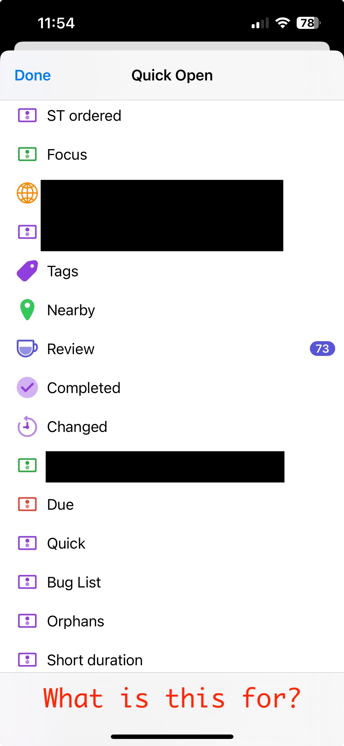
Did Quick Open on iPhone lose the “Add Perspective” option by design, or is that a bug? The fact that a fairly thick but blank bottom bar appears when I scroll makes me think it might be a bug. This is on iOS 18, using the app store version of 4.8.
Quick Open was a confusing destination for many people for managing their perspectives, so 4.8 moved that editing functionality over to Settings > Perspectives.
If you long-press on the Perspectives Bar, there’s now a menu option to open those new settings. It might help if we add a similar affordance to Quick Open!
Thanks for the screenshot! That blank bar isn’t meant to be there. (It isn’t there on iOS 26, where we’ve been doing most of our testing. But I’m able to reproduce the issue on iOS 18.) We’ll fix it.
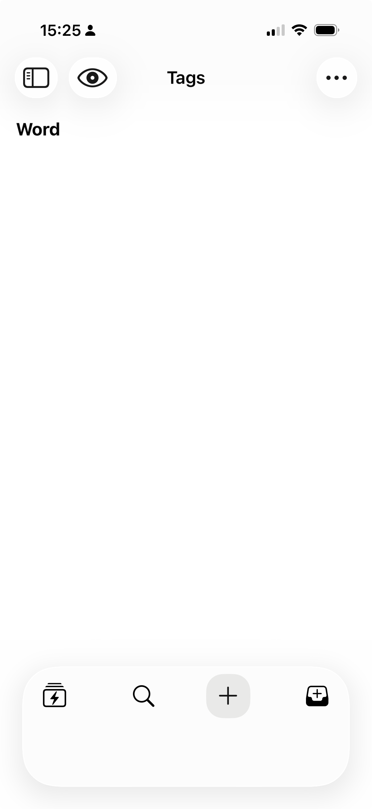
Much to like in the release, but if you have no favourites you get a really big chunk of whitespace in the launcher bar at the bottom. It would be nice if this could shrink to a single row in this circumstance.
While testing out adding favourites I also noticed that the behaviour is a bit odd, not sure if this is a bug. If you have no favourites the bar is blank, but if you add a single favourite, then the current view is added to the favourites bar. If you get rid of the other favourite, both disappear.
Im not sure if this is expected, but its a bit odd. Also notice how the button lifts up and overlaps the button above when you long press.
I miss the collapse arrows located in the top-right corner of tasks on iOS, which were used to collapse the display fields, where the flag is now. The only way I’ve found to collapse a task is by extending my right thumb to the top of the screen to tap the checkmark. I can only imagine the difficulty faced by left-handed people.
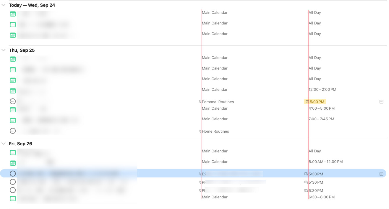
On macOS the alignment of dates columns are weird, IMO.