Thanks for the feedback! I’m sorry if this feels jarring right now; hopefully with more exposure to the Liquid Glass design language of the entire system it will start to feel less so.
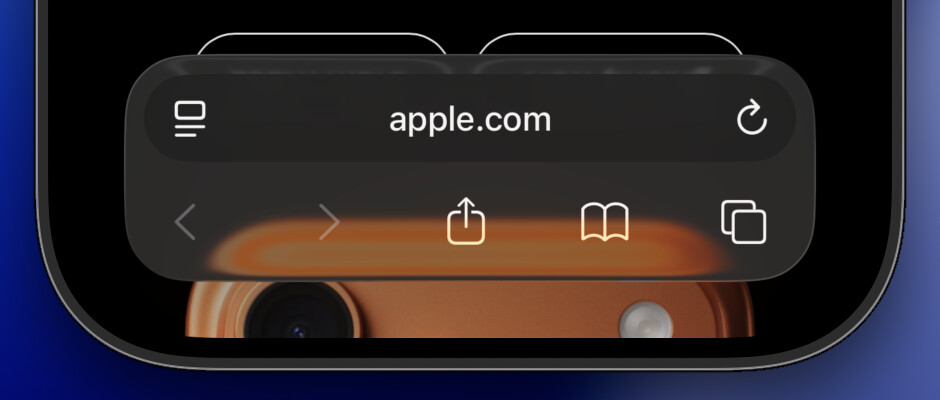
Specifically, the OmniFocus 4.8 navigation bar is designed to fit in with what we see in Safari when using the Bottom bar:
Part of the Liquid Glass design language is that the curvature should be concentric. So the selected perspective highlight here is concentric with the curvature of the corners of the bar, which is concentric with the curvature of the device:
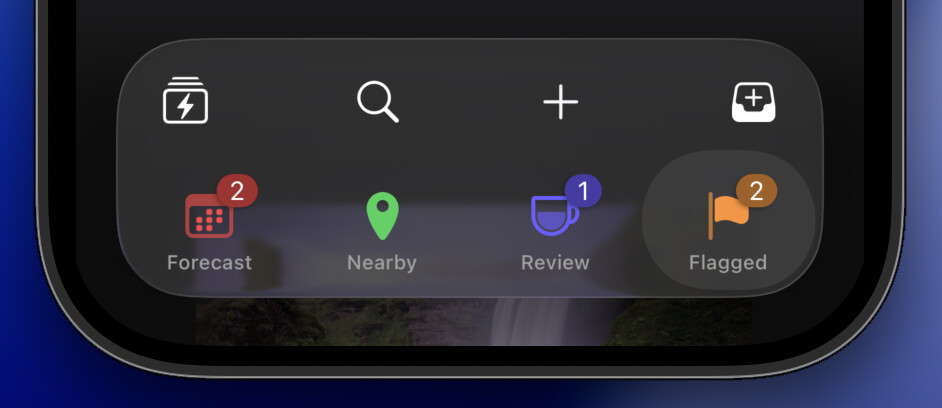
As you can see in this screenshot, the perspective icon falls in the center of the selection highlight, with the title as an annotation below and the numbered badge as an annotation on the trailing edge above.
We experimented with that, but it felt a little noisy—and the current approach gives those icons bigger tap targets.
Hmm, are you scrolled to the top of all of those screenshots? OmniFocus tries to remember each perspective’s scroll position, which can leave their headers out of alignment. But if you scroll to the top of each, they ought to be aligned:
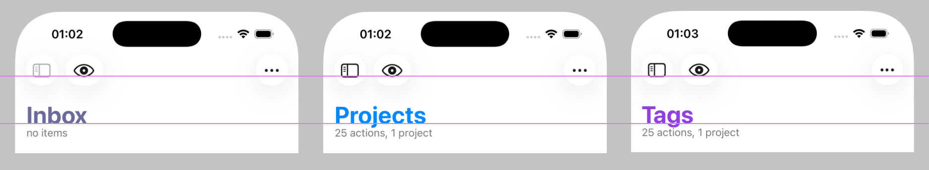
(Maybe we should automatically scroll perspectives to the top when restoring a perspective’s scroll position that’s near the top, to prevent this sort of casual misalignment from being restored and giving a bad impression?)
Thanks for digging into the details and sharing your specific concerns!
