My Omnifocus and Better Touch Tool setup
OK as requested.
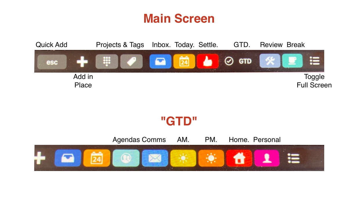
The first bar is my default setup some buttons are constant across all screens such as the inbox, today and toggle full screen buttons.
The “main” (default) bar gives me access to the main sections of OF I need, as well as providing me with a logical workflow. The “settle” button opens a sub screen with buttons that link to my morning routine of settling the system, inbox, reviews, forecast, inbox etc.
The “Today” perspective shows me an overview of meta tasks (work on xyz project), as well as flagged and those tagged “next”
The GTD Button takes me to the second screen shown, with what for me is a logical workflow.
Check Agendas, Check communication tasks, process morning tasks, process afternoon tasks, check home and personal tasks.
For example in “afternoon” I may have a meta task to write a blog, which links to the blog perspective, this allows me to reduce the need to tag everything, I just have a perspective showing related tasks for that project.
The last two buttons on the main bar are the “review” sub screen which has a specialist set of perspectives I use for reviews such as overdue, treading water, stalled etc.
Next I have a coffee break button. This shows me things I want to read, watch etc. so I can quickly read a blog post, check a forum such as this one when I need a break.
Lastly the toggle full screen button is attached to a macro which switches from full screen with both sidebars and the top icons showing, to a simple list view, no sidebars, menus etc resized to a fixed width and position, an idea (as is the base for this workflow) borrowed from Kourosh Dini and his excellent book.
Basically this allows me to navigate OF without remembering numerous keystrokes, particularly when in compact mode. I guess it is the equivalent of setting up a KBMaestro palette which could accomplish the same thing.
Hope this helps and gives you some inspiration