I usually forget to mention these on the forums, so please forgive me if you’ve seen these already.
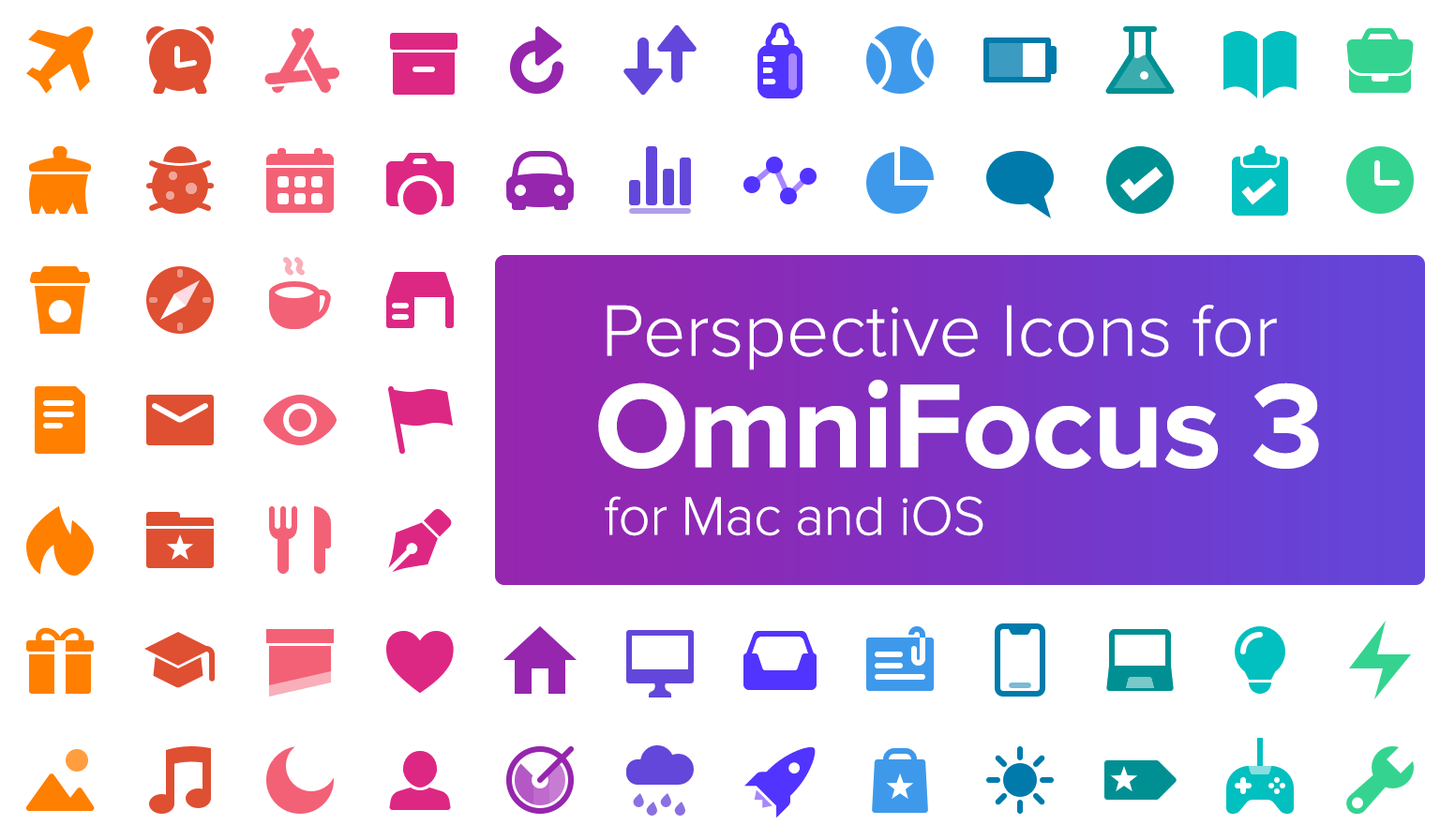
My free perspective icon set has been fully updated for OmniFocus 3, including a new style that works well with the Mac version. All 24 colors are supported, and there’s (mildly awkward) installation how-to videos should you need them:
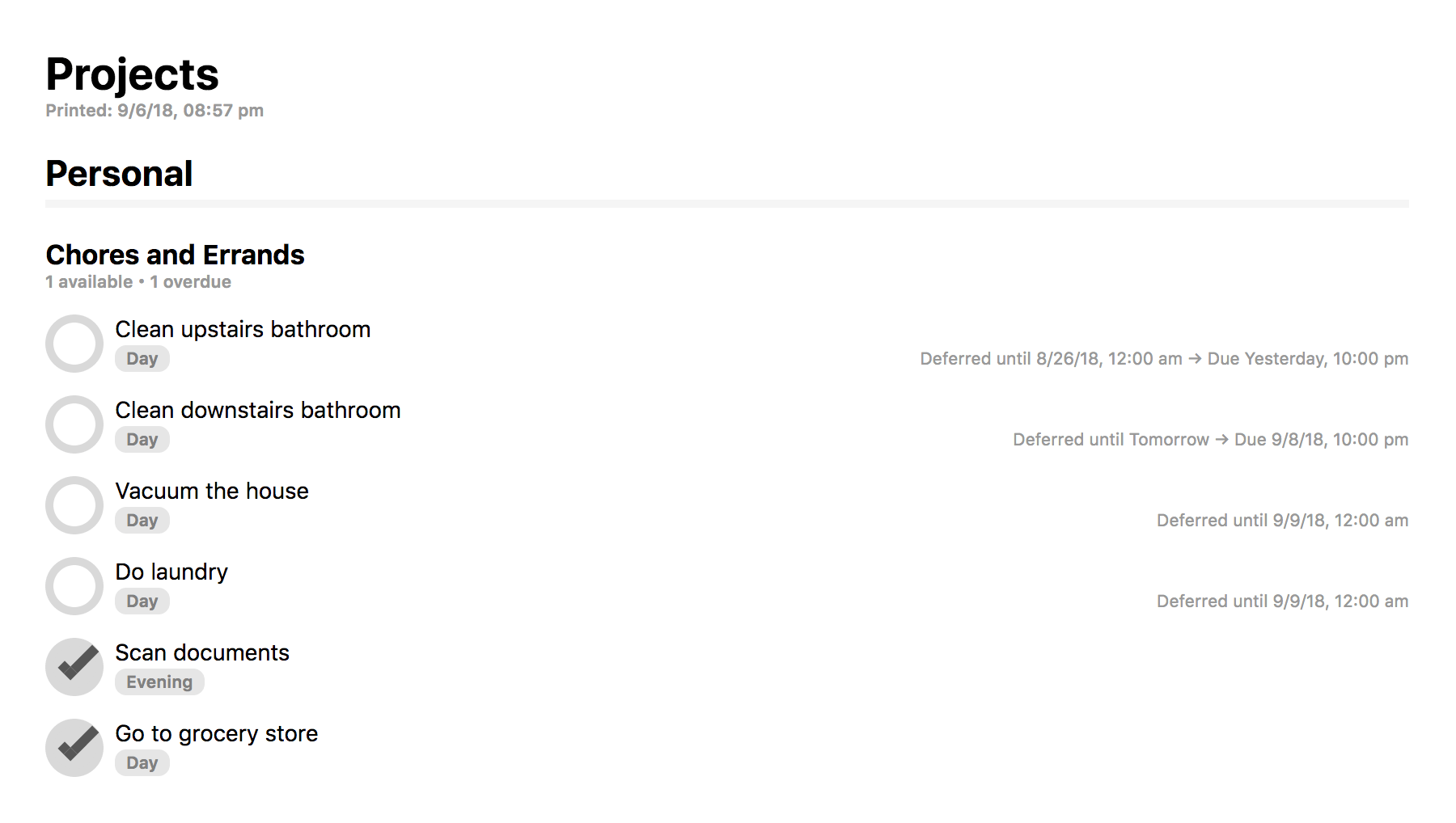
I’ve also created a custom HTML export template that can be used to change how the Mac version both prints out and exports to HTML. I feel it resembles the app a little more, and includes actual checkboxes, so perhaps some of you will find this helpful. Here’s a screenshot:
I’ve been using the icons you had made since v2. Thanks!
However, there is one oddity that’s been bugging me since v2 icons, which I see is still the case with v3 icons. Why are those icons not exactly the same colours as the ones in OF’s colour set? It is obvious that you have prepared those icons meticulously, along with the web page, so I find it hard to understand why the colours don’t match exactly.
I’m guessing that it is not as simple as picking the colours from the app, because the app probably applies a filter during render, so if you pick the exact colours from the app, they would show differently after the rendition. Is that the case? If so, I wonder if you could get the actual colour codes of their colour set from OmniGroup!..
Hey zdlo,
I’ll certainly double check that. If you have a screenshot illustrating the problem that would be helpful!
I’d note there is an issue with Firefox I’d forgotten about where dragging the icon to the icon picker causes it to lose its color profile, usually resulting in a slightly lighter than intended icon. That an instance where it’s better to use Safari or Chrome, or download the icon first, and then drag it from the Finder which sidesteps the issue.
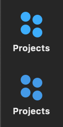
I used the files directly on v2, and from Safari on v3.
As can be seen, they do not render the same on my mac. The first ones are the original blue and light purple used in OF3, the second ones are from the website using Safari. Dragging the file from Finder or picking it from the menu gives the same result. It is not just the blue and light purple that do not match. None of the colours I have tried have ever matched either on v2 or v3. The mismatch is noticeable also on iOS.
Ahh, I see. So, the built-in Projects and Tags icons are actually using a color that’s not included in the 24 options provided by the color picker. If you create a custom perspective with one of the built-in icon options it’s similarly not possible to match those colors.
I’m kind of tempted to add them as additional options. The text of the perspective title in the header still wouldn’t match up, but the sidebar would look ok at least.
Do you mean they have used different colours for the default icons and their matching colours on the colour picker for the texts?
But then… There are default views that cannot be substituted with a perspective. Forecast, for instance… It will always have that off colour, and our reds will never match it. And for Flagged, Projects, Tags, and Inbox… Even though they can be replaced with perspectives, it is impossible to get exactly the same utility and view out of them, even with the upgraded filtering options.
So, I think it would make sense to add colours for all the icons that would match the colours of the default icons. In fact, those colours are more important, considering that the icons are to go with the other icons.
Do you think the text colours of fixed views (Forecast, Flagged, Projects, etc.) match the ones on the colour picker? If so, then all the text and icon colours are complimentary instead of matching, which shouldn’t affect out custom perspectives. If not, it means they changed the colours of icons or texts at some point, and either forgot to change the rest, or kept postponing to do so, probably indefinitely.
They don’t is the thing. Inbox, Projects, Tags, Forecast, and Review all use a color for their icon and title that’s not one of the options made available to custom perspectives.
I could add icons that use the colors used by those built-in perspectives, but it wouldn’t be possible for the text color to match exactly, which again, wouldn’t be so bad on Mac, but might be pretty noticeable on iOS. I’ll give it some thought. It’s also something Omni might iterate on.
(Sorry for the deleted post on the other thread. Responding before coffee is always a bad idea 😉)
@deaghean I also use your carefully redesigned set for v3 on Mac. They fit perfectly with the new OF UI style and are a pleasure to look at all day. I wish OF would allow choosing different perspective icons for Mac & iOS since the rounded icons are also beautiful (I use those for a few iOS-specific perspectives).