Please return the option “Icons and Text” to the customize tool bar options.
I don’t want to have to create and assign custom icons to these scripts. They’re bound to be tweaked (requiring new icons) and identifying with subtly different icons is just not efficient.
Why was this removed? It’s a staple option in all Mac apps and OF 2 had it.
Yeah, that’s unfortunately not an option with that toolbar type, which is one that puts the window controls and toolbar contents next to each other. Safari’s a good example of a built-in app with a similar setup and constraint.
Thanks @deaghean. I see the difference in the placement of the window controls now. It doesn’t seem the bit of extra real estate is near worth the loss of functionality.
However, I’d still like to know why this was done and if it can be returned to as it was.
I’m assuming it will not be “fixed” and I’ll have to deal with it, but still curious if it was based on user feedback or some other decision.
I suppose if this is my only major complaint after being a stalwart OF fan all these years, it’s wasn’t a bad run.
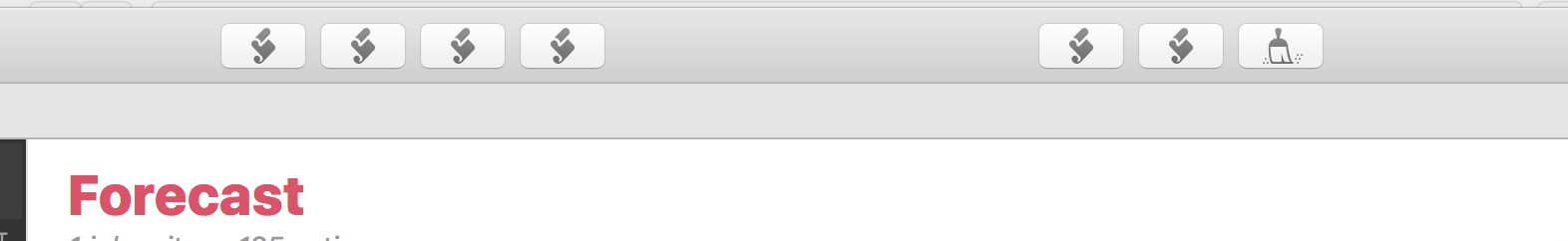
So I tried making custom icons for my applescripts used in the toolbar and it’s not viable. The icons are too tiny to be of much use for the work involved making the icons.
It doesn’t make sense they did it this way, and it’s not even clear what if anything Apple is dictating.
The Mail and Preview app in Mojave are the old style that let you use icon and text.
The Calendar, Maps, and Photos apps are the Safari way but don’t allow customization. Safari seems to be the odd man out in using the integrated toolbar and allowing customization… and OmniFocus, of course.
That approach makes more sense for stripped down apps that have minimal icons to memorize. It doesn’t make sense for more complex apps that have a lot of different stuff that could go in the toolbar IMO.
I agree with the OP. The Icons are too small and I would like to be able to have aline of text (one word) describing each ‘button’.
It’s rather annoying that fundamental usability appears so far down the feature list with tools like OF. Some basic human-centred design would do wonders here.
Including text description of toolbar buttons should be an option, at least.
I’m curious as to why folks keep saying this is an Apple issue. I have several apps in High Sierra, Catalina, and Big Sur that have toolbars with icons and text just the exact same as they always have. I also checked the developer docs and there are definitely options to create toolbar objects that have text.
I do know there are different toolbar types but what’s the issue with Omni changing the toolbar to one that allows for both icons and text because it is definitely possible…
I’ve worked around this by using Keyboard Maestro. When OmniFocus is the frontmost app, I have a group of floating window palettes that appear. I grouped all my perspectives into these floating window palettes.
I have a floating window palette for my daily review perspectives, another palette for inbox processing. You can create as many perspective groups as needed.
I tinkered with this idea here:
I can also add macros to the floating palette that can trigger macros as well. I’m a lazy guy and will forget keyboard shortcuts. Using the floating window palette allows me to just click on a macro.
Macros can also include a series of steps. I have a Keyboard Maestro macro that automatically puts OmniFocus into the left side of my screen and Fantastical in the right side. Then I switch the Fantastical view to the Day view or Week view. This sets up my windows so that I can drag and drop OmniFocus tasks from the OmniFocus window over into a time slot in Fantastical.
Keyboard Maestro is my go-to weapon when I want to automate complicated steps into a single click.