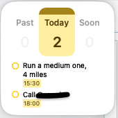
The Forecast Widget (small size) on macOS, iOS, iPadOS wastes a lot of space in the “calendar” section, the part in which the previous day, today, and next day are shown. Can this be re-designed so that that section doesn’t take up so much space and therefore more space is allotted to upcoming tasks?
I don’t see a reason why the part highlighted “Today” needs to take up ½ of the widget. It’s a static number and all we need to know are two details: that it’s for today, and how many tasks remain; doesn’t need all that space.
Particularly on iOS where the screen is small, reducing the size of that “header” could be a really positive move.