I sent an email to OmniGraffle support about 36 hours ago. Have not heard back. Posting here in case this ends up being a quicker way to get clarification. I wrote:
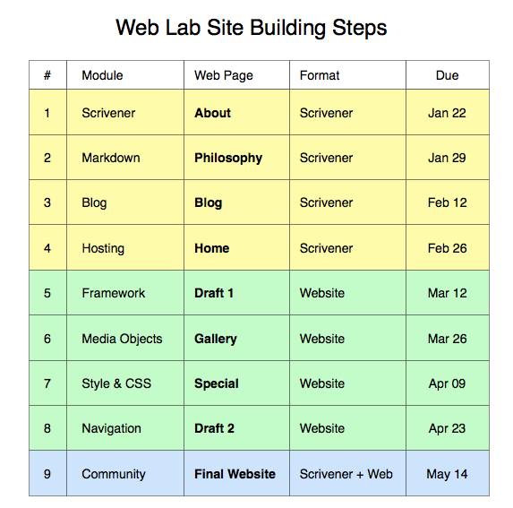
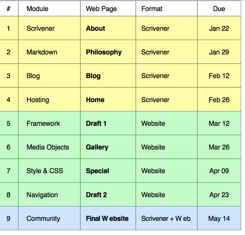
Problem with SVG exports using text. See the attached Graffle document and the resulting SVG document. Look at the last row of the SVG: an extra space has been placed between the “W” and “e” for the phrases “Final Website” and “Scrivener + Web”.
This seems to be a bug. I exported SVG as “selection (current canvas)”. Can anything be done to fix this?
I am attaching PNG screenshots of SVG export file and the original OmniGraffle file. Notice the last row of the table: both “website” and “web” have an extra space in the SVG version but not in the original Graffle. Any ideas?
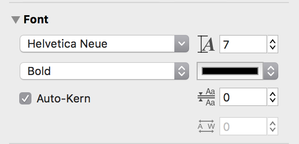
I believe this happens if you uncheck “auto-kern” in your inspector on some of the items. Can you select the text in those items and make sure auto-kern is checked before you export to SVG? If so, that should include the ligatures where needed to avoid this space after the letter “W”.
I can confirm on my work computer that I have auto-kern checked and the exported SVG is fine. I will test with my home computer (where I made the table originally) to see if auto-kern was unchecked on it. But I think you are correct and this likely solves the problem.
Thanks so much!
I’ll only reply again if it turns out this did not solve the issue.
I’ve just tested at home. I did make sure auto-kern was checked as being on. (Since I share the document via Dropbox this may have been done from my office computer using the same document yesterday.)
When I exported: most everything turned out fine, except for the word “format” (but other problem terms were fine). This was a different result from my office computer. Both are running 10.12.2. Office is a 2013 iMac 27, home is a 2016 MacBook Pro 13.
I had used the “scale stroke and font” option when resizing my table. This lead to font sizes of 14.09. So I manually changed to 14 exact. Same results (one bad word) when exporting to SVG.
The font I was using in the table was primarily Helvetica Light (with some bold cells). I just changed to Helvetica Neue Light and all exports fine. So there seems to be some problem handling Helvetica Light text (in some cases) when exporting to SVG. It seems there is no problem with Helvetica Neue Light. Might there be a good reason for this? (I can see the two fonts use different spacing between individual characters.)
Kern pairing values are provided by each font, so it is possible that Helvetica Light didn’t provide either the ligatures or kern pairing values needed, and once you changed to a font that provided those, they were used. I’m glad you found a workaround to the problem!
It could also be that you had some attribute applied that caused text be treated as a scaled object rather than text in SVG, so then the kerning values would not be used as you’d have only the shapes rather than the text.
Since you did contact support, you may want to follow up to get a more detailed review of this scenario. They can tell you with more certainty if what you are seeing is expected.
Many thanks for your suggestion. It turns out support told me this is a known general bug (SVG and text). So it’s good to know they are working on it. The support person actually said with some fonts I may want to experiment with:
turn off Auto-Kerning in the inspector.
In some cases, it also help to turn off Ligatures as well
It turns out that if I do turn auto-kerning OFF with Helvetica Light then all works fine! (I guess I always had it ON with both machines.) However, I have no idea where ligatures are to be found. Is it the same thing as “line spacing”?
Another way to achieve better visual spacing in that situation is to use kerning. Kerning, either automatic or manual, aren’t the same as ligatures or line spacing. Kerning is how horizontally close the characters are to one another as defined by their kern pair values in the font. There’s some information on the difference between automatic and manual kerning at https://en.wikipedia.org/wiki/Kerning#Automatic_and_manual_kerning.
Line spacing (sometimes known as leading in traditional print typography) is the vertical space between lines where ligatures replace the use of 2 characters with one specific character that includes both letters (this is for very precise typography in special cases). Typography is a bit of a hobby, so that’s why I was hoping to give you some ideas to try as workarounds. I hope this isn’t too nerdy. Once you know all of the settings to tweak, it can give you more control over how you want your type to look.
SVG Export Problem
Thank you for letting support know about this SVG issue. The forums are good for quick suggestions. With so much interaction between OmniGraffle, the fonts themselves, and SVG export, support humans know the most about emerging issues and can get them filed properly.
Too true! They literally used to put in extra lead between the lines at press time to make that space in traditional printing presses. I’ve had the pleasure of seeing that process in action! I’d recommend it if you love books or are interested in history.
We’ve made some significant changes to SVG for OmniGraffle 7.7 and we’d love to know if these changes fix the issues you’ve had when exporting to SVG. OmniGraffle 7.7 is available as a public test build here: https://omnistaging.omnigroup.com/omnigraffle/