Hi
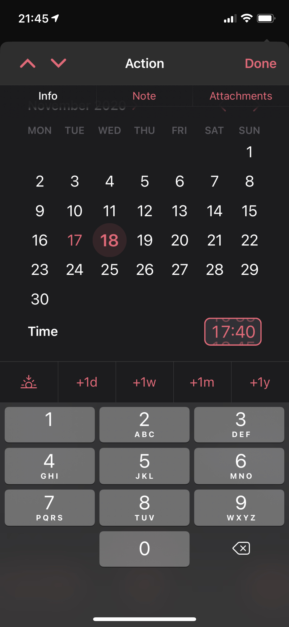
When editing the time of a due date or defere date for a task on iPhone the date picker fill the whole screen so I have to scroll to be able to see any other fields in the task.
Anyone else here having an issue with this?
Hi
When editing the time of a due date or defere date for a task on iPhone the date picker fill the whole screen so I have to scroll to be able to see any other fields in the task.
Anyone else here having an issue with this?
Honestly no, never found the need to scroll an issue. Plus if you just tap the “defer” or “die” text the date picker disappears
Scrolling is always going to be a thing on any feature rich app on a small screen and I much prefer the new date picker over the old one.
Hi, thanks for answering! Sorry for getting back to you so late!
I agree that scrolling can’t be avoided on phones, but here we are sooo close to avoid it for a type of action I do sooo many times each day when adding defere and due dates.
In the screenshot in my first post the “due” text is not visible, and I think that is the main problem. Is is almost visible at the top. If it date picker had just been a little bit smaller it had been visable, and then this would not have been an issue. Otherwise your tip about clicking the “due” or “defer” text is great :)
Any other smart triks to enter date and time with less scrolling?
TIA :)
This topic was automatically closed 30 days after the last reply. New replies are no longer allowed.