Does anyone else using the “Light” color palette find it near-impossible to distinguish which tasks are selected vs unselected? The only thing to distinguish selected tasks is a thin grey vertical indicator bar on the left of the task.
It seems like such a glaring flaw, I feel I might be missing some option. Is there some option to increase the selected tasks’ visibility (beyond “use Dark mode”)? If not, is anyone else frustrated by this design?
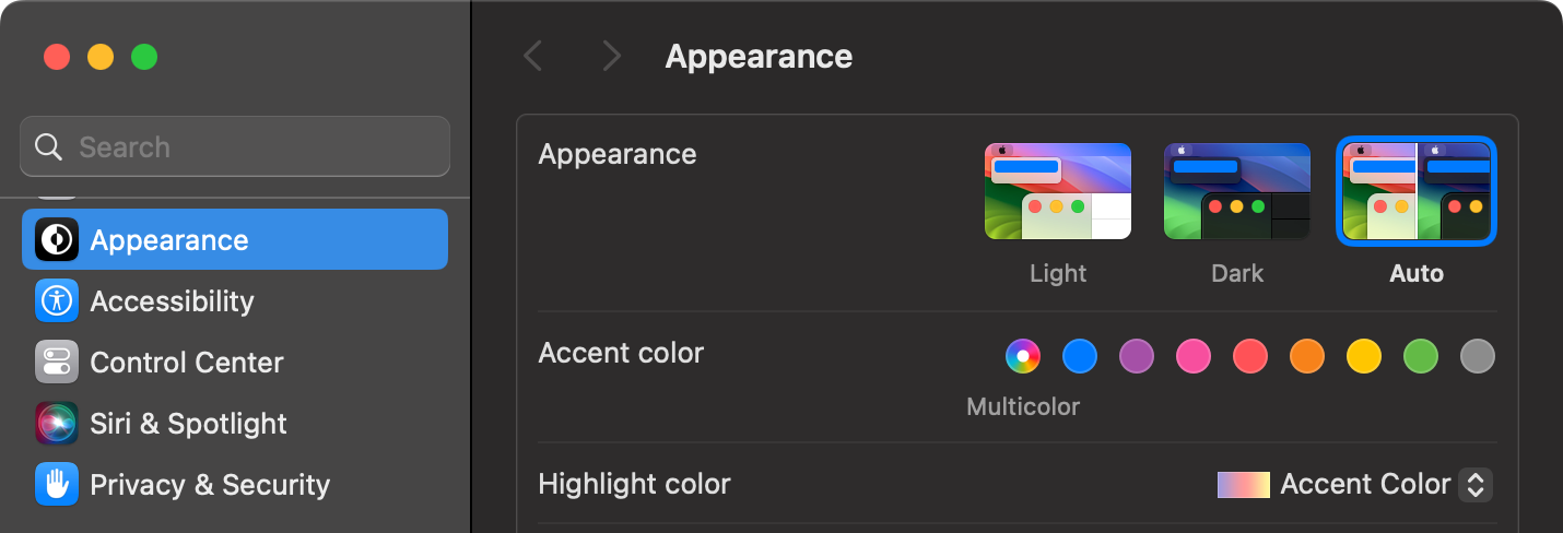
I find it easy to identify what’s selected in OmniFocus in both light and dark mode. I recommend experimenting with the system-wide Appearance settings in System Settings. Most notably, the accent and highlight colours
Thank you @timstringer ! I hadn’t considered system-wide highlight settings, I presumed this was app-internal behavior. My system-wide “graphite” defaults were near-invisible in OF Light, but brighter system-wide accent & highlight colors have driven a stake into the heart of the problem.