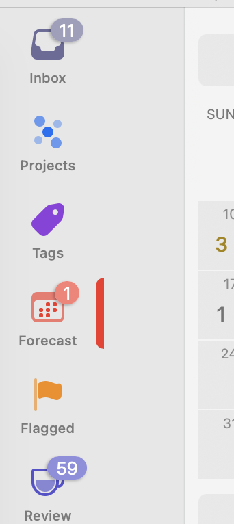
This weird bar that appears next to whatever is selected in the sidebar is really ugly. Can we lose it? Or at least make it optional and not the default?
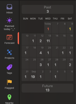
Are you talking about the red “this is the selected tab” bar? Or the extra grey space in your screenshot before the calendar?
Edit: This screenshot is on 4.7 (v183.1.155) on macOS 15.5 (24F74).
I saw a discussion about this grey space somewhere. According to OnniGroup It’s a bug in macOS 26 beta, only.
1 Like
Beauty is in the eye of the beholder. But I like the bar. If not for aesthetics then for telling me what perspective I’m in.
1 Like
Sure, knock yourself out
It seems to be a simple, subtle, and nuanced indicator to me. Nothing more. There are other ways to highlight or indicate the current perspective, but this one is effective and not offensive to me.
1 Like
@kcase We have another one, maybe you could source diagnostics from them as well to see what gives!
Can’t know for sure, but I suspect the dislike might be arising out of the space between that bar and the tasks. Then, it looks bad. Otherwise, the bar makes complete sense.
I have found that clicking the Sidebar icon twice does the job and removes the space. I have been doing it since this bug surfaced, every time I fire up OmniFocus on my computer.
