I care about OmniFocus since it’s a massive part of organizing my life. That’s why it was really sad to see that my great, 28 year old eyes got tired and dizzy while trying to look at OF2. It’s all various shades of faded black and I just felt drained of all will to live while staring myself blind at the drab, gray lists.
I’ve been passionate about design for nearly two decades and have some suggestions on how to increase content separation, visibility and also reducing the disorienting eye scanning of the default indentation.
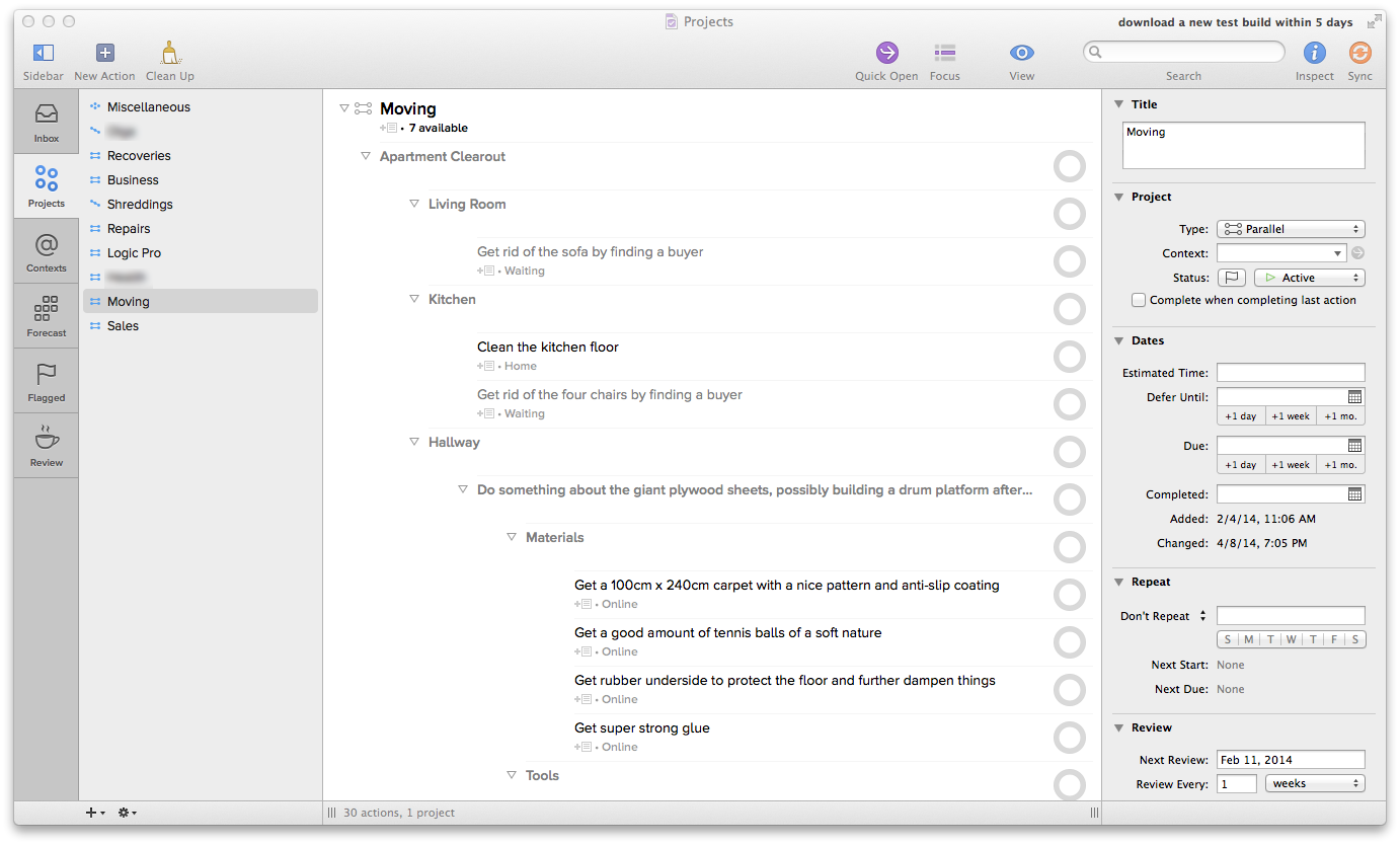
Before:
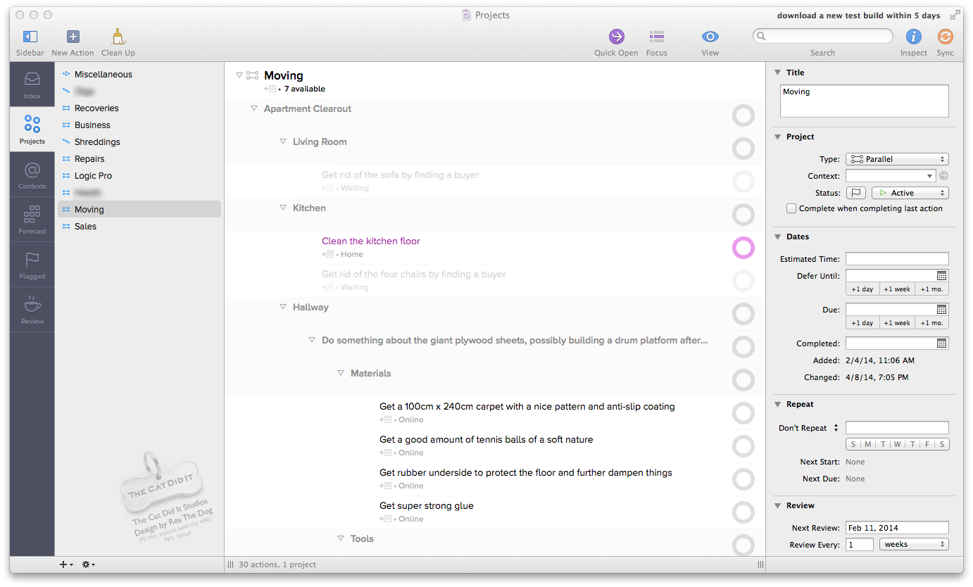
After:

Here’s one that’s reducing the ridiculous amount of default indentation, to give a tighter, less disjointed and less disorienting project overview:
Here are links to all 3 so that you can swap between them via your web tabs to get the full impact of the differences:
Before: http://discourse.omnigroup.com/uploads/default/232/983430aa4c43b7bb.png
After, still OF2’s default indentation level (which feels disjointed and requires disorienting eye-scanning to follow the broken-up threads): http://discourse.omnigroup.com/uploads/default/235/b5e2593f366305a8.png
After, tighter indentation than OF2’s default to reduce the amount of eye-movement needed and make it easier to follow: http://discourse.omnigroup.com/uploads/default/237/74f9b69b37241883.png
.
The OmniFocus 2 GUI itself is great in many ways. It just needs some love.
To summarize:
- There’s no content-separation (and someone seems to have tried to combat the disorienting grayness by using ridiculous amounts of indentation in an effort to make it slightly clearer).
- Waiting tasks are way too visible and distracting (needs more fading since they’re almost the same color as available tasks and easily mistaken for one).
- Next-tasks aren’t shown in any particular way anymore (the pink was great)
- Sub-projects haven’t got enough separation (indentation and bold is a good first step but not enough).
- The sidebar on the left is really bright and flat.
- The default indentation is totally overboard and causes the eyes to scan left-to-right too much which makes it feel disjointed and disorienting.
Luckily, that’s all cosmetic. OmniFocus 2 seems better than OF1 in every other facet!
.
Edit: PSD with adjustment layers available for Omni wizards and anyone else who wants to have a look:
http://www.speedyshare.com/zeTuF/download/OF2designv2-dark-psd.zip
(if that doesn’t work, try http://www.speedyshare.com/zeTuF/OF2designv2-dark-psd.zip and click the underlined filename at the top, not the “Download” link at the bottom since that’s an advertisement).
Feel free to take the file and contribute your own design ideas to this thread. It’s conveniently split into various adjustment layers and colors and contrast can therefore be tweaked quite easily. I stayed true to an OmniFocus-like color scheme in my design, but feel free to do whatever you want!


