Hoping this is dead simple, and I’m missing something. I am using OG to create scientific figures and a lot of my figure legends contain sub and superscripted text. These really do a number on the line spacing and create quite a mess. Is there a way to select text and force line spacing to remain uniform across each line of a paragraph or block of text?
No.
But you can obtain text blocks in OG that contain sub and superscript that look decent. However, it is not dead simple because:
- the whole issue of text handling is not dead simple
- you need to approach the task (any particular application of a text handling issue) in a consistent way, that is, the understanding and the approach are important.
Method
The purpose of this post is allow readers to get the best text handling (consistent; predictable) that is available in OG, and to overcome some of the limits of OG text handling.
-
The first thing to understand, and therefore to constrain your work, is that OG is a drawing tool, not a word processing tool. So do not expect word processing precision and ease from it. Nevertheless, the text handling in OG is quite good, more than adequate for good drawings. I use subscript and superscript text quite frequently, and I need text handling to be easy and uneventful … that means predictable.
-
The short answer is, yes, the text handling provided in OG (as opposed to that which can be expected in a word-processing toolzz) is less than consistent. Eg. I expect to set
Spacing/LineHeight/Exactly = n pt
and therefore obtain line Spacing that is exactly n pts, regardless of Subscript/Superscript, but OG does not do that. -
Which predicates a long answer.
-
-
The second thing is the TextObject in OG is broken (difficult to work with; finicky; changes with the weather; changes more with the version): text in the TextObject behaves differently (worse) than text in (eg.) a RectangleObject.
-
Therefore I never use the TextObject. Instead, I use a RectangleObject for text.
- This is probably the most important object in all my diagrams
- I have set up all the properties for text, once
- This includes Spacing and Tabs
- I have placed it on every Stencil
The Generic Object
It is stated in generic (top-down) terms, so that it covers all needs, the specifics for subscript and superscript text are at the end. The instructions are for OG Pro V5.4 (V6.X and V7.x are different, and keep changing).
-
Create a generic TextRectangle object.
-
Draw a rectangle object.
-
Set the size for the object to (eg) 1 cm X 1 cm.
-
Set WrapToShape Off.
- The size does not matter much at this point, because if it does matter (specific use, and WrapToShape is On), it is the first thing you will change when you use the generic object, so use some recognisable size.
-
Set the Fill to Solid; Colour to White; Opacity to 0%. This will allow you to Select the object and move it around easily.
-
Set the Stroke to 2pt solid red. Then turn the Stroke Off. This will make the object (and therefore the problem) visible when you inadvertently turn its Stroke On when turning the Stroke On for a a group of objects or a grouped object.
-
-
Set all the Properties for Text: Font; Colour; Size; etc.
-
Use the Apple Font Tool (Command-T), which has full capability (Underline; StrikeThrough; etc).
-
Never use BackgroundColour (it produces a shadow effect that is hard to debug).
-
I use AlignLeft; AlignTop; SideMargin = 3; TopMargin = 2.
-
I have one object for Times 9pt, and a second for Helvetica 10pt, because that is my frequent usage.
-
-
Magnets. I have not detailed it here, but you can set up your Magnets on such TextRectangles in the same way, to obtain consistent and great-looking (across the entire diagram) Line spacing.
-
Place it on the Stencils that you commonly use.
Usage
Grab one such generic TextRectangle object, and stick on top of whatever object you need to have text in.
-
This overcomes the problem wherein the text area that OG sets for the target object (eg. for weird shapes) is inadequate or hard to use, and you just want a nice clean rectangle of text in it
-
This is also good for (pretty obvious) when you need text blocks that contain different Fonts and FontSizes that are easy to manipulate and change (rather than having different Fonts and FontSizes in a single text block)
-
You can group the objects for convenience
-
Again, the size does not matter, except when you need to set the width (horizontal) to fit the target object, or some other space that is relevant to the drawing. In which case, set WrapToShape, and drag the handle to fit the space that is required.
Example 1
Here is a simple example, simple in the sense that the finished product and woking with it is simple, but of course the object is non-simple, it has some thought put into it, which is why we are here.
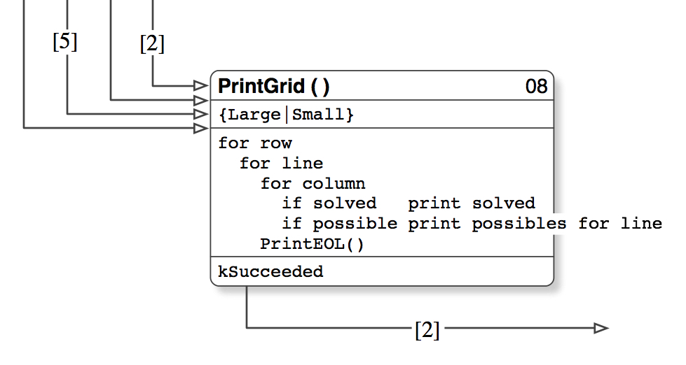
This enables the idiotic UML single-symbol-for-everything to be worked easily. It has:
-
2 TextRectangles in the body
-
1 TextRectangle with Magnets at top left & bottom left.
-
Regardless of the size of the symbol, which changes based on the content (daft), the text in each TextRectangle bahaves as set up
-
the Lines (Magnets) line up with the Grid.
- This produces a diagram in which all lines line up with the Grid, across the entire diagram, a thing of beauty and consistency (whereas a diagram in which the space between the lines differs across the diagram draws the eye to that inconsistency and ensures its ugliness is noticed).
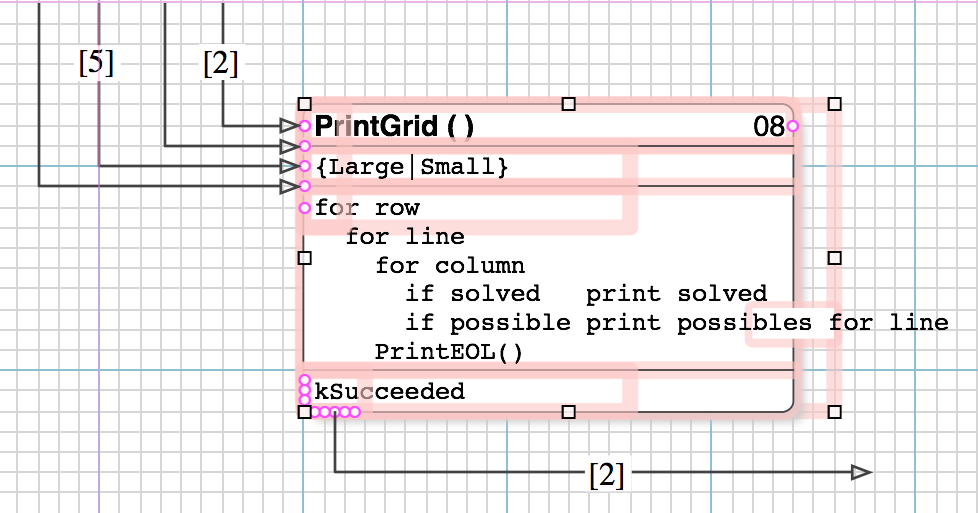
Example 2
I have set the Stroke to a thin blue line for all objects, so that the Size is visible, and Top- and SideMargins to zero, to eliminate the alignment difference that would cause.
-
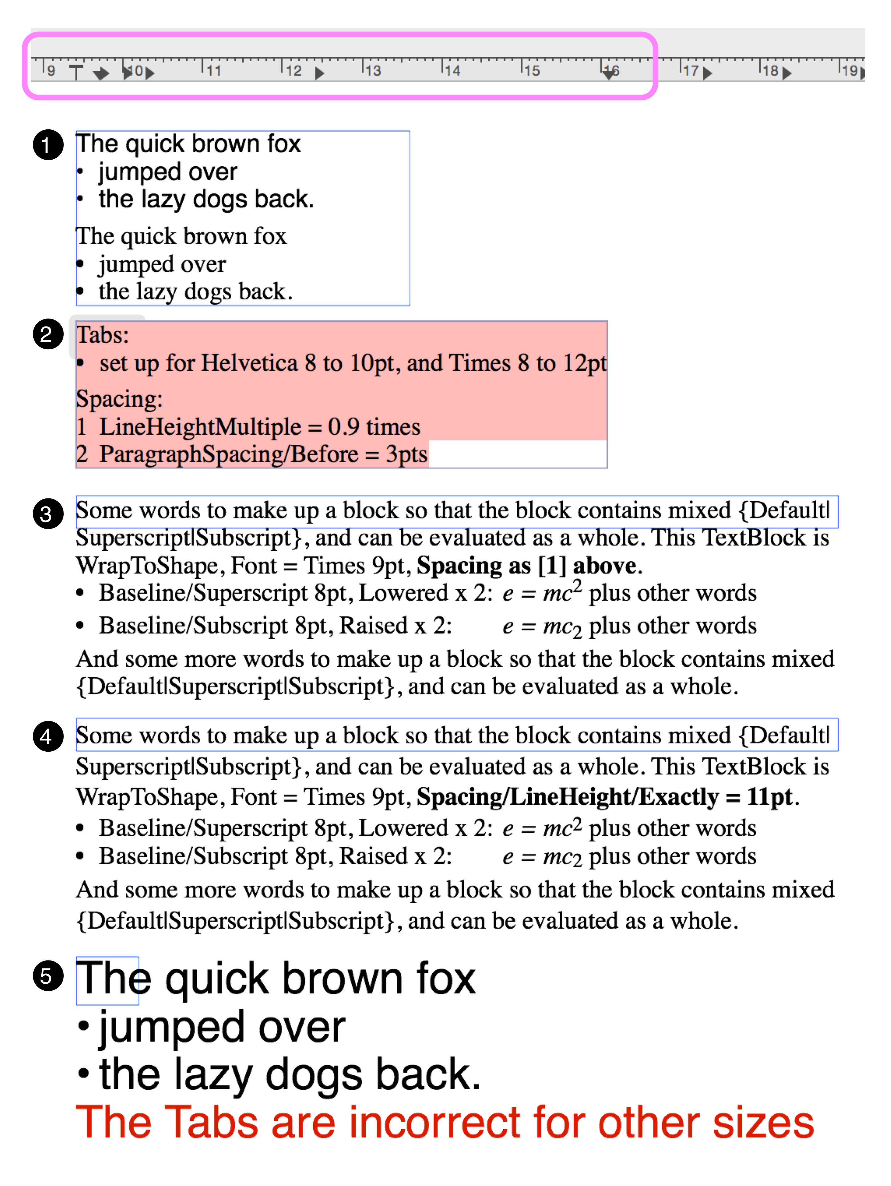
Example of a finished object, using the TextRectangle, that is what we want the text to look like in simple terms.
-
Inspecting the TextRectangle a bit deeper.
-
This shows the Tab set up (Bubblegum, on the Ruler) for 3 indentations, which I use a lot of.
-
It also shows the line initial Spacing that I use, which is good for everything except Subscript & Superscript. The effect is visible in [1] [2] [3] and [5].
-
Set line Spacing as you require.
-
-
Finally, we get to your specific requirement: Subscript & Superscript. With Spacing set as per [2]. For Subscript & Superscript, as a matter of course, I use:
-
a FontSize 2pt smaller than the body
-
and then set
Format/Font/Baseline = Subscript|Superscript -
and then set
Format/Font/Baseline = Raise|Lower X 2
This line Spacing is good enough for most purposes. But as you well know, and as most people can see, it is definitely not even.
-
-
With a view to obtaining better, more even line Spacing. Set:
-
Spacing/LineHeight/Exactly = 11pt.
If one is to set the line height manually, for a body that is 9pt, 11pt is perfect. -
The line Spacing is distinctly better than [3], but still not correct (as mentioned in the introduction).
-
Note that you have to use the stated sequence of settings:
1 Set line Spacing/LineHeight/Exactly
2 Baseline = Subcript|Superscript
3 Raise|Lower X 2
otherwise it will be badly messed up. -
When a TextRectangle (or TextBlock) gets messed up, and you are trying to correct it, make sure that you first
Select all text and set Spacing = Single
before attempting the other settings. This is because that reverts it to default settings, a known and loved point, and then any subsequent settings which are based on that will work as expected, whereas otherwise your subsequent settings are based on a messed-up point, which is hard to debug.
-
-
Simply demonstrates that the Tabs are set for the intended Font and FontSize. It needs to be changed for others.
Alternative
The alternative is very good, thus it cannot go without mention.
-
Do your scientific figures and formalæ in Grapher (comes with the Mac, in the Utilities folder). That allows full control of Fonts; Operators; Symbols, as well as Spacing, and beautiful alignment (even for Greek).
- Pages is legless, because Apple has reduced its feature set.
- You can you go to an older version: I use Pages '09 exclusively, because that has the full feature set before the decapitation. But it does not have the required CopyAsPDF.
- At worst, Grab will do quite well.
-
Select the formula and CopyAsPDF
-
In the OG document, Paste. That works even in a TextRectangle, just treat it as the image that it is, that it takes some amount of lines. That is, ensure it is on it own text-line.
Cheers
1 Like
Guru, Thanks much for such a thorough reply. I will attempt to digest and apply your recommendations.
1 Like
You are most welcome.
