OmniFocus for iOS, stuck on iOS 7?

Quick Bio: Artist (actual painter), life long ADHD with ‘extreme sensitivity.’ I currently use Things 3 but had used OmniFocus for 3+ years prior.

Took a bit of time reading through this thread this morning. There’s a lot to be read and written, many great passions about one idea or another.

For what it’s worth, I whole heartedly agree with David. Though I understand and respect others ideas for what works for them visually, great design is great design and will, to me, always interest more people than bad design. So much could be written about this, but such conversations often digress from the original topic.

I switched to Things 3 as well because ultimately, I want to be inspired by my tools more than I wanted them to function perfect. Perfect being the ‘power’ of OmniFocus, which is of course very good. I smile more when I use Things 3 but admittedly there are times I look back at OmniFocus and think to myself, ‘I wish I could do that in Things 3.’

But growth is emotionally difficult and at least at this point in my life I’ve no desire to get comfortable. So Things 3 stays and my routines have changed as a result.

Is Things 3 better (for me)? Yes.
Perfect? No.
If OF design was in-line with the style of today’s modern apps would I switch back? Definitely.

But like everything on this particular topic, this is just opinion for what personally I desire. ;)

Sincerely,
Christopher
1 Like

In these discussions, I’m invariably reminded of this fantastic quote by Ray Eames:

What works good is better than what looks good, because what works good lasts.

I’m not claiming OmniFocus is perfect (of course not) but there are, for me, a whole list of issues with Things that prevent me from saying: it works good. Starting with Undo, all the way down to the lack of true visual and conceptual hierarchies.

Make no mistake: I love, absolutely love thoughtful and beautiful design. But when it comes to my main productivity system, I will choose something I can depend on 100% long before I choose something beautiful.

And every choice is a trade-off, a compromise. Maybe I could shoehorn everything into Things 3, maybe there’s a workaround for not being able to complete recurring to dos before their due date, maybe, just maybe, I can try and reduce some folders. But I’m not willing to trade that for defer dates, the review process, a better and clearer hierarchy, attachments, and more.

For me, every application is measured against my current system. And if it doesn’t stack up against OmniFocus, it’s absolutely not worth switching.

Just to end with a small anecdote. I’ve been using OF since the Kinkless GTD days and on OS X/macOS I have never, ever seen the application crash. And I confess, I probably don’t have the most complex database, but still. However, when I downloaded the trial of Things 3, and played around with it for a couple of hours, it crashed twice.

Furthermore, I appreciate Omni’s adoption of new features: they’re already implementing drag and drop and Sirikit. Tags (and hopefully more reminder options) are also coming in Q4. I then ask myself, save for many visual refinements, what did Things 3 bring to the table in terms of new and updated functionality?

But again: if Things 3 makes your workflow better, if this helps you get things done more efficiently: fantastic. For me, it doesn’t by a long shot: OmniFocus is still my trusted and reliable system.

3 Likes

Christopher,

I couldn’t agree more. Well said. For the life of me I can’t understand why people think we cannot have a nicer and more beautifully designed UI? Why is it that when myself and others purpose a newer, fresher design, people reply defending OmniFocus’s feature set? Seriously, this isn’t about features. It’s about design. What’s so hard to understand about that?? When OF 2 came out on both Mac and iOS it was 10 times nicer to look at than the version before it.

1 Like

I guess it’s a matter of taste and preferences. Like you do, I also work with graphic design (at least partly), and while I think the design of Things 3 is very attractive and hope that The Omni Group will find inspiration in it, overall I still prefer the design in Omnifocus. To me, structure and functionality are important parts of the design. Just like @OogieM in a well expressed earlier post in this discussion, I prefer the text based picture in one of your examples. It’s boring, yes, but it’s more useful.

I tried Things 3 out of curiosity, and I really liked the design, both on the Mac and on the Iphone. Still, the design of Omnifocus is much more helpful when I use the application, especially on the Mac. It gives a better overview, as it uses the whole sidebar space to present only what I have chosen in the tabs to see. It indicates what I am looking at by color coding the text in the sidebar. It separates the tasks better by using thin lines. It gives a much less cluttered view by keeping different symbols and pieces of information at different places instead of putting most in a long line after the task title. It gives much more information, as I can choose to show the task notes without opening the tasks.

The design of Omnifocus could be a bit more polished, but the polishing should in that case be done carefully. In my opinion, Things 3 sacrifices functionality to keep the design as clean as possible.

I would love to have the customizable button row that you proposed in an earlier post at the bottom of my Iphone screen though, @davidc!

1 Like

This post was flagged by the community and is temporarily hidden.

OmniFiocus is slowly evolving from its OmniOutliner/Kinkless GTD roots. I liked Things 3 because it is breaking way from the heavy outliner-style mode that OmniFocus still heavily relies on. OF2’s Forecast is a good step towards breaking away from the outline style view.

I was just looking at Pagico’s demo video and kinda liked the look. It has an interesting user interface. I will probably download a demo but I’ll have to do that at another time. Workload kinda busy for me to invest some in-depth time in checking out Pagico.

I saw Pagico was a part of the setapp.com subscription package. Still mulling over the setapp subscription right now.

I’m just hoping Omni will take cues and see what they can do to break away from the typical outline mode we see in OF1 and OF2.

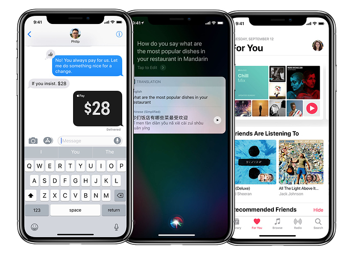
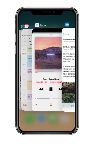
Well I guess Apple is getting ready to make a whole lot of people feel “boxed in” with all those new rounded corners within literally every app on the iPhone…