Struggling to get used to OF4 from OF3 (Mac)

Despite having had an Omnifocus 4 license for 2 years, and wanting to take advantage of the features, I’ve really struggled to get used to some aspects of the OF4 user interface (see below) and have ended up continuing to use OF3 instead.

This is clearly not a sustainable path, as more (exciting!) features are added to OF4 and the database structure will eventually become incompatible if I want to take advantage of them.

So - in the interests of trying to move with the times - can anyone suggest how I can address the following frustrations I’ve had with OF4?

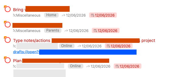
  1. Alignment of editable fields (e.g. defer/due dates) - in OF3, the defer/due dates were off to the right of the Outline view near the status circle, and therefore all lined up vertically. In OF4 they’re directly to the right of the Projects/Tags - which means that unless all projects/tags are identical in length, the dates don’t align vertically. This frustrates me more than it perhaps should - I find it much easier to scan down an aligned vertical list of dates. I don’t think there’s a way of getting around this?

  2. In OF3 Forecast view, when changing due dates in the Outline for a given task (e.g. typing “1d” to move it to tomorrow) then hitting Tab, the row immediately ‘disappears’ from view, which is organised by Due date. In OF4, this doesn’t seem to happen consistently - I think it is because the Tab flow isn’t doing the same thing. But I’ve not been able to work it out. Does anyone have suggestions on how to do this? I regularly want to tab quickly through tasks, pushing them out to different days, without taking my fingers off the keyboard - and have them ‘vanish’ from view immediately.

  3. Font size - with OF3 font size set to medium, I can clearly read the text in the Outline view on both my 14” MacBook Pro and external 2560x1440 25” display. On OF 4, using the default (System Font Regular 13.0), it seems just a little too small or ‘light’ on the external monitor and is harder to read. I can’t seem to figure out why - from what I can see it is 100% black, rather than dark grey, which would’ve been my first instinct. Did OF3 use a different, more ‘dense’ font?

  4. Edit: added another one - deleting a task in the Outline view in OF3 can be done with Backspace, but this doesn’t seem to work in OF4 - you have to hold down Cmd as well. Is it just something I’ve missed?
Most of these things are small niggles, and it’s entirely possible there’s some user error going on, but collectively they’ve generated enough friction for me to have put off switching so far.

Thanks!

  1. There isn’t a direct equivalent to the v3 layout. When if you switch a perspective’s layout from Fluid to Columns, each field will be aligned across rows. But in order to accomplish this, each field will take up space whether it has any content or not—so that layout ends up using a lot more horizontal space, and is only available on Mac. Sticking with the Fluid layout, another approach might be to reorder your fields so that your Project and Tags fields follow the date fields instead of preceding them. The date fields will still have variable widths that vary based on your date format settings, but perhaps this will be an improvement? Worth experimenting with. (Please do email in feedback about this, I’m not seeing any requests related to this in our tracking database.)

  2. In v3, we received a lot of complaints about tasks disappearing out from under the keyboard the moment a date was assigned (before people had finished entering all of the information they wanted to add to the task), so we changed this in v4 so the task waits to disappear until you’ve finished editing. You can indicate this from the keyboard by switching views, by moving the cursor to a different task (e.g. by pressing the Down Arrow key), or by using the Clean Up command (Command-K).

  3. Hmm, that’s curious! The default font is still the same System Font in v4—though we’ve also given the user a lot more control, letting you choose a wider variety of sizes, weights, and even completely different fonts. We’ve also added a new Black variant of the Dark color palette, so those who prefer stronger contrast have that option. But none of those changes would explain why v4 would be harder to read on your external display. Oh, wait, is your external display set up as a non-Retina display? That could make a difference in how the text renders. (Apple’s latest frameworks no longer support sub-pixel antialiased text the way they did when we built v3. I think Apple’s assumption is that pixels on most modern displays are small enough to no longer need this. There are some third-party tools like Display Menu that can fake out the system so it renders its content for a much denser display, then antialiases everything down for the actual display. I used that approach for a while, before I upgraded to an external display that directly supported Retina.)

  4. In General Settings, there’s a switch that controls whether deleting items requires the Command key.

Hope this helps!

1 Like

@kcase thank you for your response, Ken!

  1. I have to admit, I’ve never fully explored/understood the columns/fluid layout options - at least since OF2 - so I will have a play around and see if there’s something that suits me better. Like a lot of features I think I learned what worked for me years ago and haven’t revisited… Thanks for your suggestions on fluid though, and I will do my best to make some time to email in feedback.
  2. I suspect this is one of those ‘you can never satisfy everyone’ issues - particularly with a package as complex and with as long a history as OF! I can certainly see how if you’re not used to something disappearing it would be disconcerting. I’ll try to retrain my muscle-memory - I use Cmd-K to clean up the Inbox already.
  3. You’re right, it’s a non-retina display (Dell UltraSharp U2515H) so that might indeed explain subtle differences. I’ve been waiting for there to be more options for 5K displays… In the interim I think I can make it work by boosting the font to 14, which isn’t too big on the Retina display of the MacBook Pro but is big enough on the external.
  4. D’oh. It’s right there… thanks for pointing that out!

I’ve got one other niggle that occurred to me after I’d posted - I’ve had OF3 set with the ‘always use dark sidebar’ option (in fact, I’d not realised it was even an option). I see others asked for this to be reinstated during the beta period 3 years ago, in more than one topic/post, but I don’t think it made it… perhaps I could add my voice to this request?

Thanks again for your engagement, I appreciate it!