[Tutorial] Autoresizing box with multiple sections and rounded borders

Hi folks,
I am writing this for others who might be interested in my solution, and also as a memo to my future self.

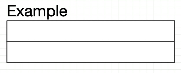
The goal is to design a box with two or more sections of text, in which each section autoresizes vertically to fit the text, and surrounded by a border with rounded corners. The former can be easily accomplished with tables (so, it requires OG Pro), but it took me a while to figure out the trick to combine it with the latter. Besides, we want everything to stay perfectly aligned with a grid. So, the result will look like this:

Ready? Here is how to do it, step by step:

  • Set up the grid in the Canvas Inspector: set points as the Ruler Units, set Major Grid Spacing to 8pt and Minor Grid Steps to 2. Check Snap to grid and Show grid lines. The spacing for the grid is inferred from the height of the font we are going to use (Courier). See below.

  • Draw a 96x12pt rectangle (check the size in the Object Inspector). Choose Arrange > Make Table (OG Pro only!).

  • Drag the table’s bottom handle to create three vertically aligned cells. It should look like this:

stencil1

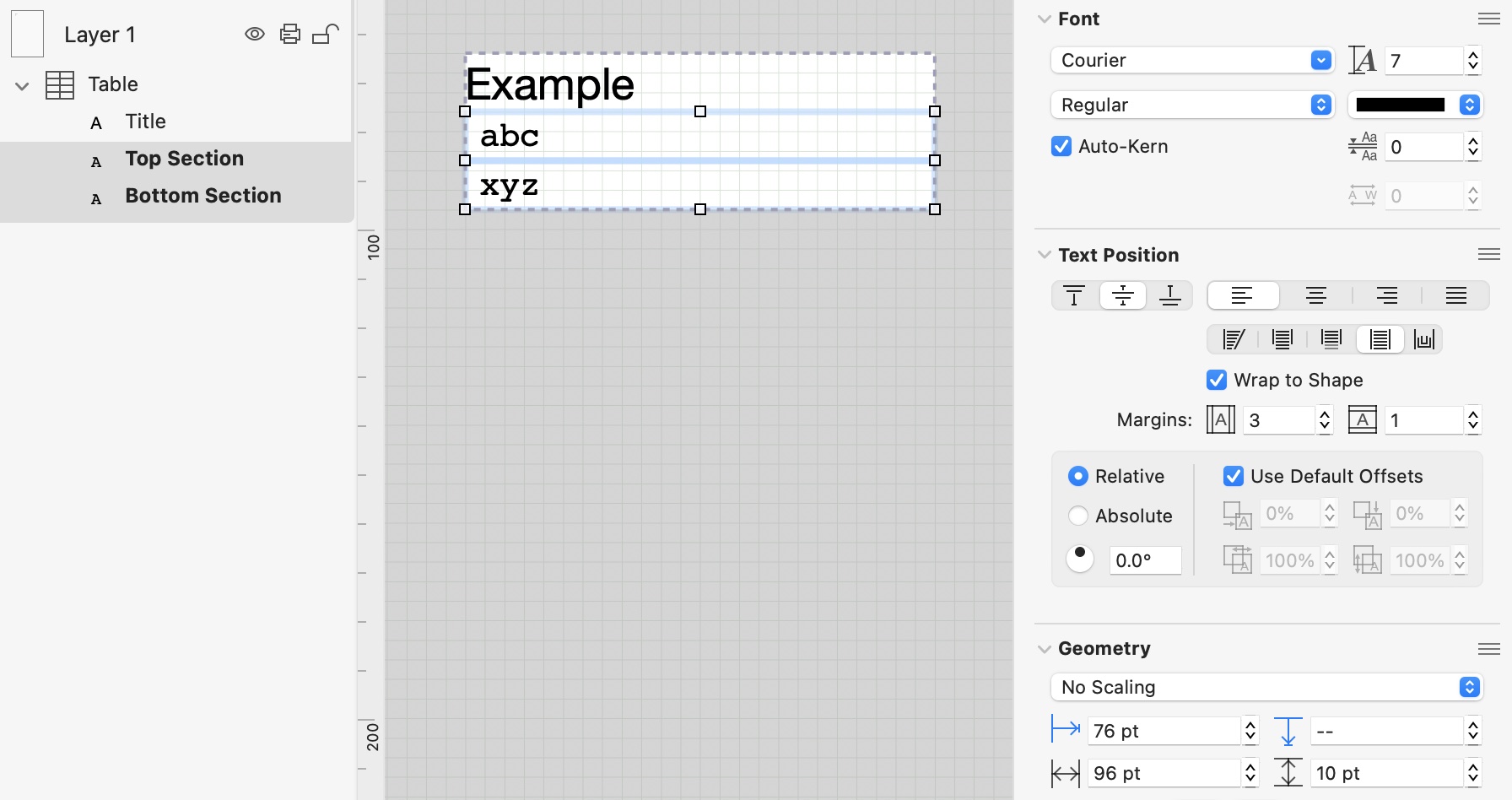
  • In the left sidebar, expand the table, rename the three rectangles TItle, Top Section, Bottom Section, respectively, select the Title rectangle, and set the following properties: No Fill; No Stroke; Helvetica Neue at 9 pt; left aligned text, allow text to overflow shape, don’t wrap to shape; 0pt left/right margin, 0pt top/bottom margin. Give the cell a title and set its height to 12pt:

stencil2

  • Select the Top Section and Bottom Section rectangles, and set the following properties: No Fill; No Stroke; Courier at 7 pt; 0 pt line spacing; left aligned text, text flow, wrap to shape, 3pt left/right margin, 1pt top/bottom margin. Type something in each cell. Verify that the whole table has size 96x32pt. If the vertical size of the table is not a multiple of the grid size, tweak the height of the title cell to fix it (it should be 12pt, as per above):

Note that the Top Section and the Bottom Section are 10pt tall; but if you add more lines, each line extends its cell by 8pt. That is why the grid’s size was chosen to be 8pt. So, the table’s vertical size will always be a multiple of 8pt (provided that each section contains at least one line of text). For the following, make sure that there is exactly one line of text in the Top Section and one line of text in the Bottom Section (so, the two sections should be 20 pt tall—plus 12pt for the title equals 32pt overall height).

  • Draw a 96x20pt rectangle and set the following properties: white solid fill, black single stroke, rectangle shape, 4pt corner radius. Put it to the background (Arrange > Send to Back) and drag it under the table, to fit the text of the Top and Bottom Section:

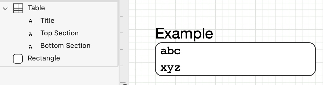
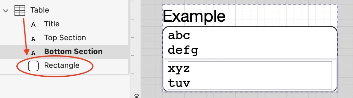
  • Now for the magic trick: in the sidebar, drag the rectangle into the table, under the Bottom Section. Now, when you edit the Top or Bottom section, the rounded rectangle should automagically adapt.

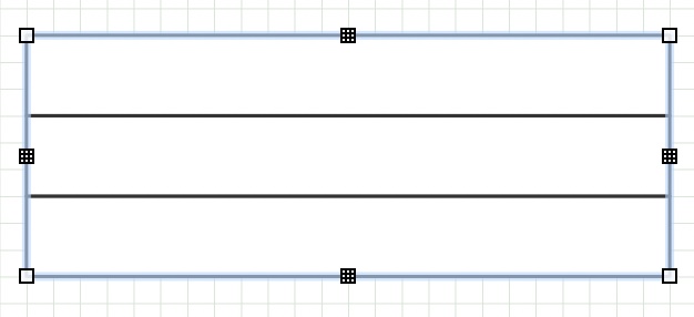
  • As a final touch, add a line separator: choose the Top or the Bottom section, and add four magnets at the corners. Then, select the Line tool and draw a separator line joining two magnets:

Remove the other two magnets if you want. That’s it!

If you want to design a similar stencil with your own fonts, I’d recommend that you start by building a table and checking first of all the line height of the font you want to use, and how it affects the table’s height, possibly with some top/bottom margin. With a bit of trial and error, you should understand what the optimal grid size should be. Having a title cell (whose height can be set explicitly) gives some leeway to compensate for the height not being a multiple of the grid size in some cases (in the above example, a one line cell was 10pt tall, because we have added a 1pt top/bottom margin, but each subsequent line extended the height of the cell by 8pt, not 10pt, giving cells of height 10pt, 18pt, 26pt, etc.).

1 Like

The example you have provided is the Table symbol from IDEF1X, the Standard for Relational Modelling of data.

About 20 years ago, I developed an IDEF1X Stencil for OmniGraffle 4, with all the IDEF1X symbols. I have published it on Graffletopia (long before OG had a Stencil site), along with Stencils for other modelling methods:

It has all the articles that you describe in your tutorial, plus:

  • correct placement on Layers
  • colour and shadow
  • Magnets in the right places
  • spacing carefully organised on a Grid
    • completely eliminates the need for monitor Object size against the Grid
  • OG Pro (Table element) or not (text block)
  • substantial notes for drawing IDEF1X models

Your tutorial has a minor improvement that requires the current version of OG (a Table with three elements), whereas mine is a Group of three elements, one of which is a Table.

The above issues are very important, and need to be worked out overall (across all Objects), because they make the final diagram consistent (or not). Of course, the use of a Stencil eliminates the need to construct the Object from scratch, and to work out the above issues.

Cheers

  1. Yes, working out spacing, and the effect on the Grid, is important.

  2. Working in point-size is not a good idea. Work with the actual paper and ruler that you use, eg:

    • A4 with Major = 2cm, Minor = 10.
  3. Get used to that Gird, and make all Shapes fit that Grid. Eg, in my Stencil:

    • the title element is 0.4cm height
    • the text lines are each a Table element, of 0.3cm height … so the incremental table height (not element height) is 0.3, 0.6, 0.9, 1.2, etc.
  4. You are better off working with the Spacing (between lines of text) than with top- and bottom-margins in a default Spacing keeping track of point-size.

    • Eg. for your symbol, I would use 0.9 x LineSpacing within the text, with top-; bottom-; and side-margins 2pt.

The point is, OG is a great drawing tool, and with any drawing tool (any software) one has to:

  • experiment, in order to become proficient
    • work out how line spacing works in different scenarios
    • as detailed in your post, and as modulated in this one
  • create Stencils and Templates

Cheers

I am aware of your stencils. In fact, as you may infer from the styles I have used, I was trying to reproduce one of them. The main issue I have with your stencils is that the surrounding rectangles and the line separators must be manually moved/resized every time the number of lines changes. What I was trying to achieve is to have such details handled by OG. The main point of my post is that you can drag any shape (or group) “inside” a table to have it automatically stretch or shrink with the table. This is something I had not been aware of before yesterday.

I agree that using a table row per text line gives you finer control on the overall size (and full control on the side magnets, btw). Unfortunately, using the “trick” I have described with a table like that is a bit more cumbersome, because when you add a row, it is added below the background shape, and you have to manually fix that:

More importantly, when you delete a row the table, for some reason, is not resized:

I also agree that it’s better to work in SI units, but if you use multiline cells as in my example, measurements must be relative to the line height, which is measured in points. Trying to fit the size of an object with “Fit shape to text” on a grid in centimeters is a futile exercise. But sure, by tweaking line spacing and margins, it might be possible to get it (almost) right. Left as an exercise for the reader :-)

Pardon me, that did not come across in your original post.

Excellent intent. It appears to be a new capability in OG 7, it was not available in OG 4; 5; 6. By all means, a feature to exploit … if possible, if it works.

Line Separator

  • The Line Separator does not require resizing (all items are 3.2cm wide).
  • It has to be moved either way (yours or mine) because the number of elements in the Relational Key (above the line) varies with each instance.
  • It does not move with every change because once the Key (above the line) is stable, it does not move
  • It specifically must not be attached to a Magnet of anything, because that would cause it to move with that thing (vertical centre in your example), rather than the fixed number of elements that it serves.

Enclosing Rectangle
Further, working with Magnets is fiddly. We want:

  • one single Shape in the Group to be Magnet-enabled (if only to avoid auto-attachment of lines to the members, which is a royal pain when modelling)
  • that one Shape to have Magnets set with the overall diagram (consistent connections) in mind (definitely not for each instance of the Table symbol). Eg. top and bottom Magnets only; horizontally centred; spread a little at the top, crowded at bottom.

Yes. That is by design, not by accident. Any alternative would be poorer.

below (in the GUI) = behind (in reality).

It appears to be even worse than that (I don’t have OG 7, I can’t check it myself): you now have two Attributes Shapes, or worse, three Key & Attributes Shapes, to make up the table element, but they are not related to each other, the OG Table is an arbitrary collection, FIFO.

Harumph. Apparent bug. No surprise, if you understand my sentence above.

Obviously, my Stencil Object does not suffer those problems.

In your example, in the OG Table, the contents are just a loose collection, not an hierarchy, not related.

Therefore, I would say, those two limitations deem (make) your suggestion unusable for IDEF1X Table symbol.

Summary
In sum, a balance has to be achieved, between what one can get OG to do (as much as possible), versus what one has to do when erecting an actual model using the Stencil objects, which includes any demanded change to each instance of the Table symbol.

  • Mine uses an integral symbol in the Stencil, that minimises the change to each instance after erection
  • Yours automates the Stencil symbol one more step, but demands changes to each instance after erection
    • And correction of the two limitations
    • And fiddling with connections to Magnets.

Nevertheless, for OG diagrams other than this particular usage (IDEF1X diagram), your initial post regarding auto-resizing a box with multiple sections, within OG limitations, may well be useful.

Grid vs Line Spacing

Yes and no. It is not that simple, as you will learn, as you progress with using OG. Eg. Line Spacing with the TextObject or the Table is actually quite good: eg. my lines are set to 0.9 x the “normal” line height for the font. No, I am not advising “tweaking”. Yes, you have to have Margins, and yes, they are in point-size units.

What I am saying is, strictly:

  • get used to the Grid (cm) and using only the Grid for all your arithmetic, because every article relates to the Grid.
  • TextObjects are (must needs be) different, because they contain some font, and that demands point-size units for increments; spacing; Margins; etc.
    • The TextObject itself remains aligned to the Grid.

Cheers