Imported from another thread.
That is a generic question, I will attempt to provide a meaningful answer.
Basics
Apples in general, and Macs in particular, have a rich variation of colours, and methods for using them. This is not a tutorial, just a hopefully relevant answer to the question.
-
The first thing is to use an Apple ColourPicker, such that you have one set of colours across all apps, and one place to set and change them. Rather than different sets of colours in each app, and the burden of changing them in each such app. That was the subject of several threads, that I have answered, I won’t elaborate the point here. If you use the colour picker on any app, not just OG, you will be severely hindered.
-
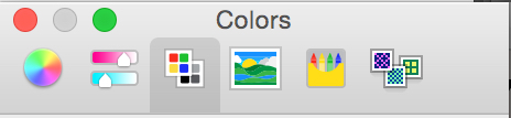
There are six methods for selecting and maintaining colours (one has a colour wheel; another has sliders for graph-like rectangles; etc). Become familiar with them and how to change them. Choose one method, and get comfortable and familiar with it.
-
Here is the Apple ColourPicker, with the six methods:
-
I have chosen the ColourPallette method.
- Within ColourPallettes, there are many ColourSets to choose from, and more can be added as colour management changes with the times (we used to have just 256 colours, now we have millions). So the third point is to choose a ColourSet that is relevant to you; Understand that each ColourSet was created by a different bunch of people, for a different purpose. Each ColourSet has different names for the colours, and they do not match or relate across ColourSets.
-
I publish all my diagrams (some are quite complex) as PDFs, that are available via a browser (at least for the first viewing, before downloading). Further, I need a stable set of colours that are standard (recognisable names, etc) and a stable way of maintainiing them.
-
Therefore I have chosen the WebSafeColours ColourSet.
-
Note the slider on the right, and the dripper. Opacity can be set precisely, by a percent fugure.
-
Note the names are the HTML codes for the colours.
-
I urge you to explore the other ColourSets, before choosing one.
That should be enough for most people, and it is certainly enough for beginners who want to set things up correctly (avoid hours of work; replacement of methods; etc).
First Step for Advanced Use
But as discussed in the initial thread, and in many others, solid colours are too bright to use in serious diagrams (we want to articulate the content of the diagram, not to demonstrate our ability with colours), opacity is a key requirement.
- Each time I colour an object, I don’t want to use the WebSafe ColourPallette; choose a colour; and then set opacity. If I did that, I would have to keep track of the opacity set for each object … and there are millions of possibilities … I would have to inspect each object and compare it with some other object I am trying to match, etc.
- Therefore I need a ColourPallette with opacity already set, and named, so I can find the Colour-Opacity fast, and recognise it.
-
First, I chose the WebSafe ColourPallete as the relevant ColourSet.
-
Next, I copied it (use the Gear button), and named the Pallette with my company name.
- This is my standard set of colours. The names, which are recognisable, are already set in the source ColourPallette.
- Next, I added Colour-Opacities as I needed, for each purpose (use the + and - buttons).
-
For each Colour-Opacity, I maintained the standard (source) names, and I added a purpose and an Opacity percent.
-
My ColourPallette, usable across all apps, looks like this:
-
Each specific Colour-Opacity, for each specific purpose, is easy to find, easy to use.
Specific Answer
Now we can answer your specific question.
-
“Sky” and “Salmon” are standard colour names in the WebSafe ColourPallette.
-
I used a standard ColourSet, therefore those names show up in your ColourPicker (whichever one you are using) as those names.
- If you use an inferior ColourPicker, typically that in a particular app, it will not show standard colour names.
-
Because I used an Opacity, they show up as “Mild” or “Faded” or whatever.
-
If you choose the Apple ColourPicker, and the WebSafe ColourPallette, they should show up correctly: the name and the opacity (bottom, highlit). Then you can figure out precisely the Colour-Opacity that I have used.
-
But if you want the ease of use that I enjoy:
- either follow the directions above,
- or I need to ship you my SG Standard ColourPallette.
Cheers
